A layout is a template that makes it possible for you to render content in a wide variety of ways. You can add rows, columns, tables, tabs and other such HTML elements. Using a layout you can create both simple and complex designs that present a wide variety of information. Once a layout is created, it is available for Editors to add to a content item from the Insert menu the same way that they add content elements. A layout can include loops, which are reusable content structures, like a tab or a column. When a loop is available in a layout, the editor can add more of the same structure and add content to it.
Layouts use the Histone template engine for rendering content. The Histone template engine uses its own proprietary language for defining templates. Please note that there is scant information on Histone scripting available. Many of the links to more thorough documentation that worked in the past are no longer valid. If you find a good link to more thorough Histone docuentation, please add it as a comment to this page.
In This Topic
Creating a Layout
To add a new layout, click [Add Layout] in the upper right corner of the Layouts panel. After the new layout has been added, its default name is "Layout (language version)" and it is selected by default in the Layouts list with default text appearing in the English and Dutch "Name" and "Description" fields. For example:
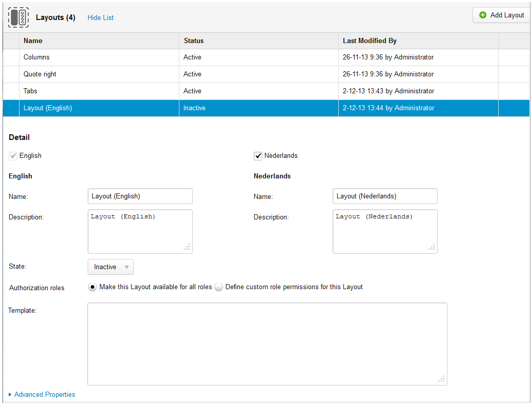
You can toggle between showing and hiding the list of layouts by clicking the "Hide List" or "Show List" link in the upper left part of the Layouts panel. The following basic properties for a layout are shown in the list:
| Item | Description |
|---|---|
| Name | The name of the layout. |
| Status | The status of the layout. The possible statuses are "Active" and "Inactive". Layouts that are "Inactive" do not appear in the Insert menu. |
| Last Modified By | The name of the user who last modified the layout and the date and time when the modifications occurred. |
Defining a Layout
The definition of a layout determines the structure within which content can be added. You also define the behavior of the layout, for example whether a sub-element within the layout (column, tab, and so forth) is static or whether more can be added by the Editor. The definition of a layout consists of a template and fields and loops, described in Advanced Layout Properties. Define the following basic properties for a layout:
| Property | Description |
|---|---|
| English - Name | The name of the layout as it appears in the list of layouts in the English GUI. |
| English - Description | The text that appears with the layout in the Insert menu in the English GUI. |
| Nederlands - Name | The name of the layout as it appears in the list of layouts in the Dutch GUI. |
| Nederlands - Name | The text that appears with the layout in the Insert menu in the Dutch GUI. |
| State | The status of the layout. The possible statuses are "Active" and "Inactive". When you change the status of a layout from "Active" to "Inactive", it will no longer be available from the Insert menu. Any instance of the layout that has already been added to a content item will still appear on the website frontend. |
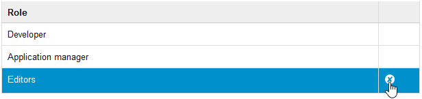
Authorization roles | Specifies which role(s) within XperienCentral have permission to insert the Layout into a content item. You can either make it available to all roles or to one or more specific roles. To limit permission to a Layout to one or more roles, follow these steps:
|
| Template | Defines the structure, look and feel, and behavior of the layout. See https://github.com/MegafonWebLab/histone-documentation for complete information on using the Histone language to define a template engine. In the template, you can also use CSS for styling and rendering HTML as well as raw HTML to render the design (H1, H2, lists, and so forth). You can also include images in the template engine. If you do add images to your layout, be sure to point to the correct part of the file system where the image is located. In XperienCentral, layout fields and layout variant parameters are declared in a specific way. Fields are denoted using the notation
The parameter "backgroundColor" is delcared in the Histone template as follows: See Layout Variants for more information. |
Advanced Layout Properties
In the Advanced Properties section, you add icons for the layout that appear in the Insert menu in XperienCentral and create the fields and loops for the layout.
Images
For the "Layout image (small)" and "Layout image (large)", click [Browse] and select the image that XperienCentral will use for the layout in the Insert menu. The small image is used in the recently used menu for content elements. For example:
The large image is used in the full list of content elements. For example:
Fields
A field is an area where content can be added. The text can either be preformatted (inline) or rich text, which can be formatted using the formatting options in the Editor. When you create a new field, you have the option of prefilling it with text or leaving it blank. Prefilled text can be modified or replaced by an editor when they add the layout to a content item.
To add a field, follow these steps:
- Click [Add Field]. A new field appears in the Layout Data Definition list.
- In the text box in the "Field" column, enter the name of the field. This is an internal tag that is used by the template engine to identify the field. The name you use for a field must be the same as the one you use in your template.
From the "Mode" drop-down list, select the input mode for the new field. The options are:
Mode Description Rich text An editor can enter rich text in this field. The rich text formatting options in the Editor will be available. Single line (flat) An editor can enter a single line of text in this field. The formatting of the text (font, font size, color, and so forth) and the color of the field is determined by the style(s) defined in the template. - (Optional) Enter the default text that you want to appear in the field in the "Default value" text box. When the layout is added to a content item, the default text will appear in the field. The text is editable.
Loops
A loop is a repeatable structure containing one or more fields. When the editor adds a layout to a content item, he or she can add more loop structures to the layout. For example, if a layout has a column that is defined as a loop, the editor can add more columns, up to the maximum number that you define. When an instance of a layout which contains a loop field is placed on the page, the user can use the information bar for the layout to add and remove repeated items from the loop field. This functionality is very useful for creating effects such a tabs or columns where extra tabs and columns can be added or removed.
From the template language point of view a loop field is just an array of objects which can be looped over. Each item in the for loop contains the fields defined inside the loop field in the layout panel. Access is done using typical JavaScript syntax.
For example:
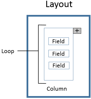
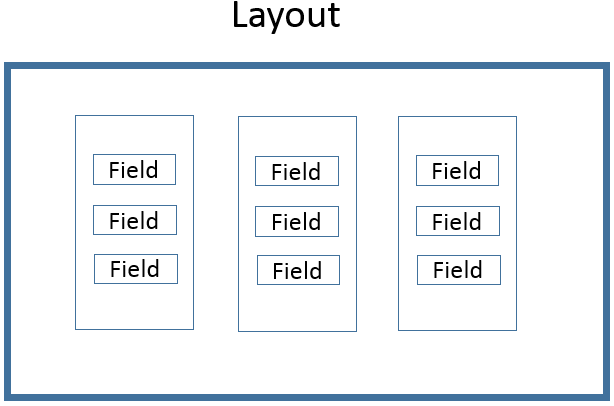
In this example, three fields arranged in a column are defined as a loop. When defining the layout, the editor can add more columns to the layout. For example:
Refer to the three loop examples below to see how to include CSS and logic within the definition of a loop.
To add a loop:
- Click [Add Loop]. An empty loop definition appears.
- Click the "Add field" button under "Actions":
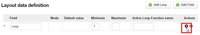
A field will appear below the loop indented to the right to indicate that it is part of the loop. - Enter the minimum number of loops. The lowest allowed number is 1. An editor is not allowed to remove loops to a value lower than the minimum number.
- Enter the maximum number of loops. This is maximum number of loops that can be in the layout.
- Add an identifier for the loop in the "Active Loop Function Name" field. The identifier is used by the template engine.
Click [Save].
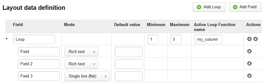
Only one loop field can be used inside a layout, and it must have the name "content".
For example:
When an editor is defining the layout in a content item, he or she can add and remove loops using the Actions menu that appears when they click in a loop. For example: 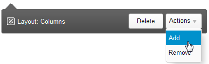
Layout Variants
Layout variants were introduced in XperienCentral version R29.1.
A layout variant is a copy of a layout that has the same structure as the layout it was created from (the head layout) but with characteristics that can differ. Layout variants always share the same template with the head layout — you cannot add any parts to a layout variant that are not present in the head layout and likewise any parts defined in the head layout will always be present in its variant(s). The power of layout variants lies in the ability to declare any fixed characteristic of a layout as a parameter and then define it differently for each variant. This saves time and energy when you want to create multiple, similar layouts in order to give your editors several options for presenting content in slightly different ways.
For example, you can create a layout containing three columns and then create one or more variants wherein the width and/or height of the columns are different. Another example is a layout containing a simple text input field with one background color and one or more variants in which the text input field has a different background color.
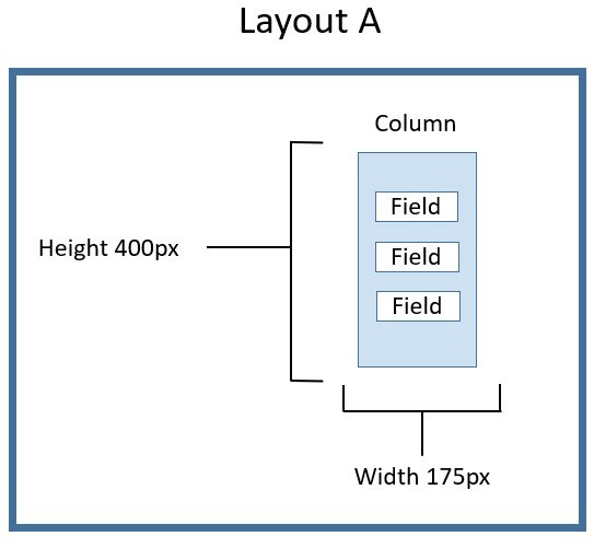
For example, the figure below shows Layout A which has with one column containing three fields. The dimensions of the column are:
height: 400px
width: 175px:
For Layout A, we created a variant in which the dimensions of the column are:
height: 550px
width: 220px
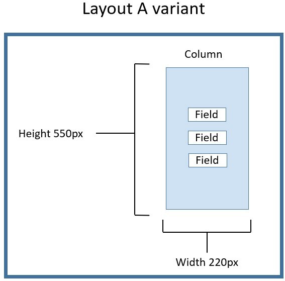
The basic structure of Layout A is exactly the same in Layout A variant: both contain one column with three fields. What is different between the head layout and the variant are the dimensions of the column.
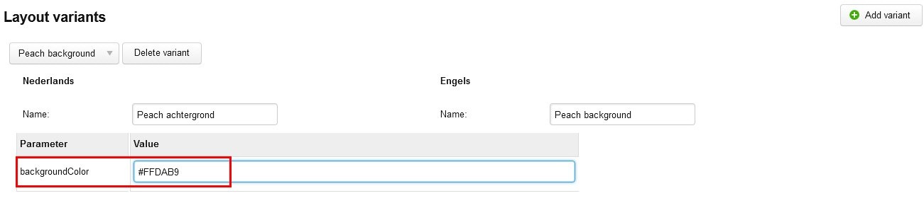
Another example: the figure below shows Layout B which contains a text input field with a light green background:
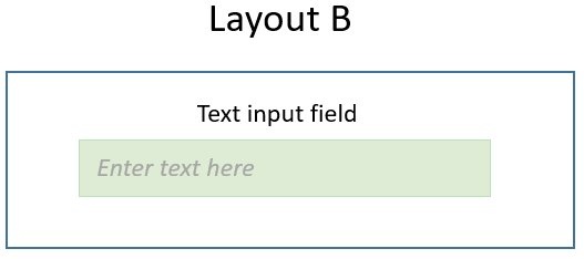
For Layout B, we created a variant in which the background of the text input field is light orange:
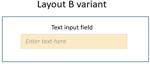
Again, the head layout and layout variant have the exact same structure but with different characteristics.
Layout Variant Parameters
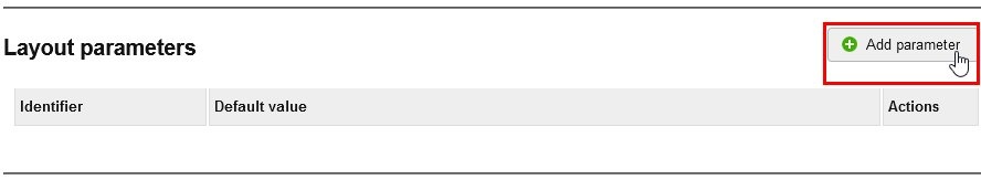
Layout variants require parameters in order to be able to customize parts of the template. Layout parameters are declared in the Layout parameters section and used by the Histone template. To add a parameter, follow these steps:
- In the Advanced Properties section, click [Add parameter]:
- Define the name of the parameter and give it a default value. For example:
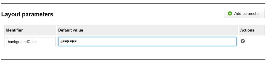
The default value is the value that is used by the head layout itself and any layout variant that does not overrule this value. For each layout variant, you can define a custom value for the layout parameter. Although the Histone template does not refer to a layout parameter, you can still define a value for it in each variant. You refer to the layout parameter in the Histone template using the syntax:{- layout parameter identifier -}
Note that the syntax {- x -} for parameters differs from the{{x}}declaration that is used elsewhere in Histone templates. The following shows a layout parameter referred to in a Histone template: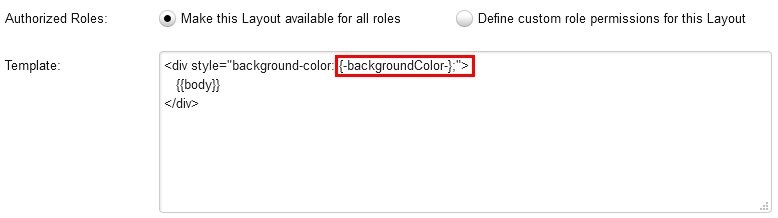
- Add all the parameters that are needed.
- Click [Save].
Creating Layout Variants
A layout variant is based on a head layout. Before you can create a layout variant, you must first create a layout. Follow these steps to create a layout variant:
- In the Advanced Properties section of the layout for which you want to create a variant, click [Add variant]:

- Enter the English name of the new variant in the English "Name" field and the Dutch name of the variant in the Dutch "Name" field.
- In the "Value" column of the Parameters table, enter the value(s) for the parameter(s) for this variant. This step is where you define the characteristics of this layout variant. For example, if this variant shows a different background color for an input field, the value might look like this:
- Define all parameters as desired.
- Click [Save]. The variant is saved.
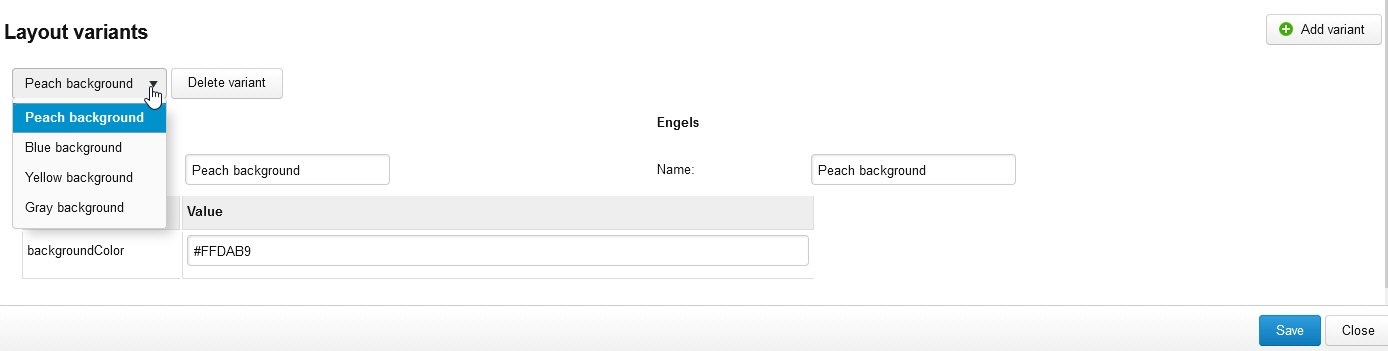
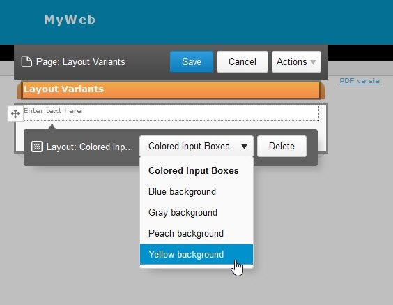
Selecting a Layout Variant
When two or more layout variants have been created, you can select them from the drop-down list. For example:
Placing a Layout Variant on a Content Item
When a layout contains one or more variants, a drop-down list is available in the Editor for selecting the layout variant you want to add to a content item. Follow these steps:
- Navigate to the content item on which you want to place the layout variant.
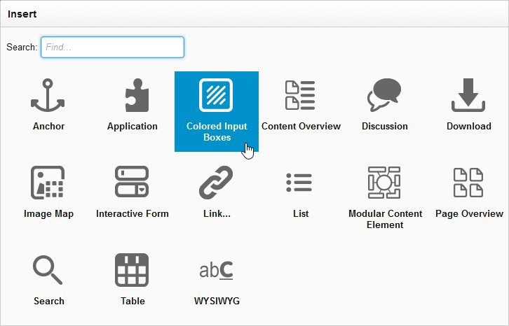
- Click [Insert] to select the layout containing the variant.
- Select the Layout from the Insert dialog box. For example:
The head layout is placed on the content item. - Click in the layout to expand the drop-down list in order to select the variant. For example:
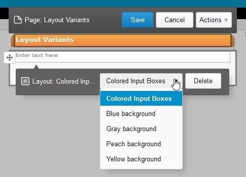
The head layout appears at the top of the list and the variants below it. - Select the layout variant from the list. It appears on the content item. For example:
the result: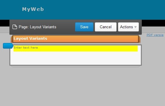
Exporting Layouts
The layout export functionality was introduced in XperienCentral version R30.
See Exporting Layouts.
Layout Examples
The following examples show sample layouts definitions and how they appear in the Editor.
Gray Box Example Layout
This simple example is a single input field that has a gray background.
Template
<div style="background-color: #d0d0d0; width: 80%; padding: 10px;">{{body}}</div>
Advanced Settings
Result
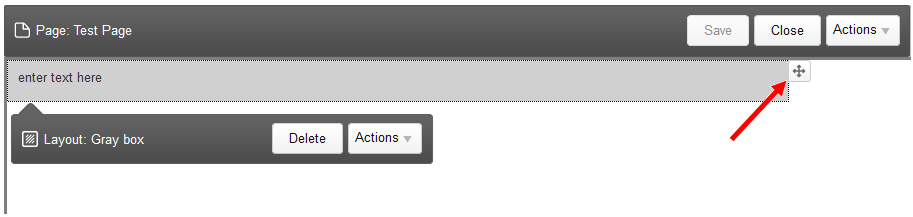
The editor can enter text in the Gray Box. The layout can also be dragged and dropped to another part of the content item using the move icon (see arrow above).
Columns Example
Here is a simple example which formats the data as DIVs which can be styled using CSS to appear as columns on the page.
<div class='layout{{content.size()}}columns'>
{{for item in content}}
  <div class='column'>{{item.body}}</div>
{{/for}}
</div>
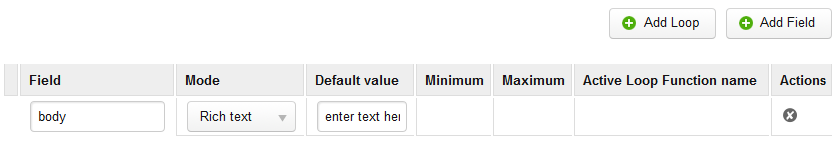
The advanced properties" now need to be configured. Here we need to add a Loop named "content". The loop has a minimum of 2 and a maximum of 5. Inside the loop we add a field with name "body" by clicking on the + icon in the "content" loop row.
Note also how we use the size() function of the loop field (content) on the first line to generate the needed CSS class name in order to format the columns correctly.
Tabs Layout Example
In this example we have a layout which supports multiple tabs. The content of the tab title itself can be edited along with the content of the main body of each tab. Clicking on each tab brings it to the front and makes it visible.
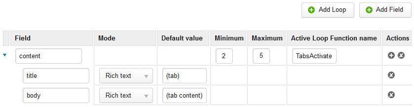
In the following example, a new layout is created. The "Layout data definition" is as follows:
- A loop is created and its field name is set to "content" and the "Activate Loop Function name" is set to "tabActivate". In the following example, you can have a minimum of 2 loops and a maximum of 5.
- Inside the content loop, two rich text fields are created and named "body" and "title".
Template
<div class='tabs'>
<style>
DIV.tab_row {
    width: 100%;
}
DIV.tab_row > DIV {
    width: 150px;
    border: 1px solid #000000;
    border-bottom: 0px;
    border-top-left-radius: 6px;
    border-top-right-radius: 6px;

    color: #000000;
    background-color: #eeeeee;
    padding: 6px;
    margin-right: 10px;

    float: left;
    position: relative;
    top: 1px;
}
DIV.tab_panes {
    clear: both;
}
DIV.tab_panes > DIV {
    border: 1px solid #000000;
    padding: 4px;
}
DIV.tabs:after, DIV.tab_panes:after {
    content: " ";
    display: block;
    height: 0px;
    clear: both;
}
DIV.tab_row > DIV.tab_active {
  background-color: #ffffff;
  border-bottom: 1px solid #ffffff;
}
DIV.tab_row > DIV.tab_inactive {
  border-bottom: 1px solid #000000;
}
DIV.tab_panes > DIV.tab_inactive {
  display: none;
}
</style>
<script>
function tabActivate(rootnode, selectedindex) {
    function activatePane(panes, selectedindex) {
        for (var i=0; i < panes.length; i++) {
            var classname = panes[i].className.replace("tab_active","tab_inactive");
            panes[i].className = classname.replace("tab_inactive",
                i === selectedindex ? "tab_active" : "tab_inactive");
        }
    }
    activatePane(rootnode.querySelectorAll("div.tab_row > div"), selectedindex);
    activatePane(rootnode.querySelectorAll("div.tab_panes > div"), selectedindex);
    return false;
}
</script>
  <div class='tab_row'>
    {{for item in content}}
      <div onclick='return tabActivate(this.parentNode.parentNode,{{self.index}});' class='{{if self.index is 0}}tab_active{{else}}tab_inactive{{/if}}'>{{item.title}}</div>
    {{/for}}
  </div>
  <div class='tab_panes'>
    {{for item in content}}
      <div class='{{if self.index is 0}}tab_active{{else}}tab_inactive{{/if}}'>{{item.body}}</div>
    {{/for}}
  </div>
</div>
The structure of the data behind the tabs is similar to the columns example above. There is a main loop part which contains groups of "title" and "body" fields. Each of there groups represents a tab. Most of the code is used to style the tabs with rounded corners. The "body" areas of the tabs are shown or hidden using CSS rules that set the display property. What ties this all together is the Javascript function tabActivate() defined inside the template. It called whenever the user clicks on a tab. It simply sets the correct CSS class on the tab in order to make it appear selected as well as to set the CSS class on the body of the tab in order to make it visible and to hide the other body areas.
This example is special in that we have used the "Activate Loop Function name" parameter for the first time. When the user clicks on a tab, the tabActivate() function is called as a result of the onclick which is part of the template itself which causes the tab to be selected. There are times, however, when XperienCentral itself needs to change the visible tab, for example, when the user navigates into the tab using the cursor keys. In this case, XperienCentral cannot make the tab switch by itself, For this situation, we configure to the "Activate Loop Function name" value with the name of a Javascript function which XperienCentral can call if it needs to switch tabs. Without this, the user could navigate to content in a hidden tab and try to edit it. The cursor would be visible, but not the content.
The function itself should be available in the page and it takes two parameters. The first is the root node of the layout instance, and second is the integer index of the tab to select/activate. The "Activate Loop Function" can also be used with other designs where something has to be done when the cursor enters an editable area.
Advanced Settings
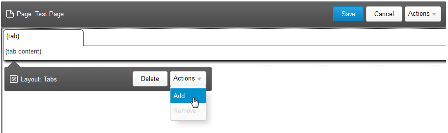
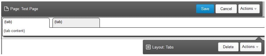
Result
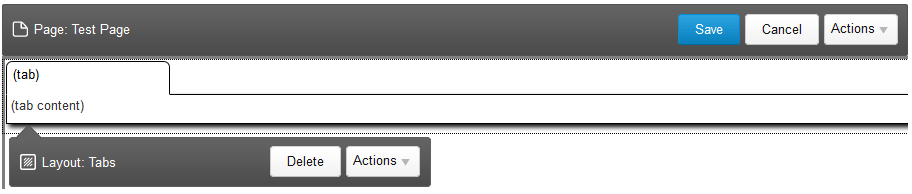
An editor is able to modify the title of the tab and add content to the tab body. The editor can also add and remove tabs. When "Add" is selected from the Layout Actions menu, another tab is added. For example:
Layout IDs
Layout IDs were introduced in XperienCentral version 10.22.0.
In some cases you might want to assign an identifier to a layout template in order to ensure that that layout instance on your content item is unique, for example, a JavaScript unique ID or a BlueConic unique ID to identify that specific content in a content item. In these cases, you can add a unique identifier to the layout template in the same way a Histone tag can add a unique ID within the template of the layout. When the layout is generated, a unique ID is added and saved. The following is an example template containing a unique ID tag.
<div class="gridelement">
  <div style="width: 500px; margin: 0 auto; padding: 120px 0 40px; font: 0.90em verdana;">
    <ul class="tabs" persist="true">
      <li><div rel="part1">{{header1}}</div></li>
      <li><div rel="part2">{{header2}}</div></li>
    </ul>
    <div class="tabcontents">
      <div class="tabcontent blockWrapperContent gridpart" id="{{uniqueid}}_part1">
        {{part1}}
      </div>
      <div class="tabcontent blockWrapperContent gridpart" id="{{uniqueid}}_part2">
        {{part2}}
      </div>
    </div>
  </div>
<script>
...
$('#{{uniqueid}}_part').show();
...
</script>
</div>
Guidelines
This section suggests some best practices to use when developing your own layouts.
Indicate Editable Fields
A layout can include both editable and non-editable areas. Use dotted lines or other visual indicators that show the user what they can edit. The following CSS surrounds an editable field with a dotted line:
DIV.rte_container DIV.my_layout { border: 1px dashed #808080; }Fields
The following constraints apply to fields in a layout:
- Field name must be unique with respect to the other field names used in the layout. The exception to this rule is when a field appears inside a loop, in which case it must only be unique from its other sibling fields inside that loop.
- Field names are case sensitive.
- Field names must start with a letter or underscore, but the rest of the field name can contain alpha-numeric characters and underscores.
- Field names must not conflict with the names of the built-in Histone statements:
if,var,macro,call,importandfor. - A field must only be the only child of the tag surrounding it.
- The tag for a field must be a block as a DIV tag or SECTION because the contents of the field may contain a
<div>or <p>, etc. (and that should not be in a<span>).
Restriction on Histone Functions
XperienCentral does not support the Histone functions include, loadJSON and loadText.
Respect HTML Tag Nesting
Fields in a layout are editable in the Editor. At the moment each editable field can be filled by the user with a mix of block level elements such as <p>, <h1>, <h2> etc tags and/or an embedded <div> which may represent plugins elements or other plugins. When creating the template for a layout choose tags like <div> and put the editable field inside them.
Fields Use All of Their Parent's Tag
Don't try to mix hard-coded text with a field in a template. For example:
<div>"{{quotebody}}" - {{author}}</div>Each field must be the only content of its parent tag. A solution to this problem would be to add an extra <div> around the fields themselves. Don't forget that CSS can be used to add text content.
Fields must often be the child of one dedicated <span> tag
Because of the way XperienCentral sometimes adds <span> elements when editing, sometimes editing a field can cause strange behavior. Some of the text becomes uneditable or the cursor keeps jumping to the first position.
To prevent this: add the field inside one dedicated <span> tag.
Layouts Must Only Output One Root Node
Layouts should output only one root node such as a <div> or <table>. There are few restrictions regarding the contents of this node, but in the top level of the template there must be only one node and not a <div> followed by a <style>, for example. The following shows example HTML that will not work as a layout:
<div class="my-box">
  <section class="my-section-header">
    <h2 class="my-box-desktop-hidden title gridtitle" id="gridtitle-1">{{gridtitle1}}</h2>
    <div class="gridpart" id="part1">{{part1}}</div>
  </section>
</div>
<ul class="gridpart" id="part2">{{part2}}</ul>
Proper Use of inline-block
In order to follow the guidelines for a responsive design, pay particular attention to the use of a floating <div>. In the Inline Editor, a floating <div> should only be used for controlling the layout of images and other content that needs to be lined up with rich text. In order to create a responsive page structure, use the display: inline-block; tag. For example:
.box2 { display: inline-block; width: 200px; height: 100px; margin: 1em; }