| Anchor | ||||
|---|---|---|---|---|
|
The middle part of the Workspace, the Editor, is where you directly interact with your website. Here you can add content elements (images, paragraphs, separators, etc.), rich text and so forth to fill in the content of your website. The Editor is a WYSIWYG representation of the content of your website which means that the appearance of a content item in the Editor is exactly the same as what visitors see on the frontend of your website. This allows you to always see how your web pages, articles, page sections, and so forth look without having to take any further action.
See also Keyboard Shortcuts for operations you can perform in the Workspace using just the keyboard.
Select your version of XperienCentral below for complete information about the Workspace.
| Expand | ||||||||||||||||||||||||||||||||||||||||||||||||||||||||||||||||||||||||||||||||||||||||||||||||||||||||||||||||||||||||||||||||||||||||||||||||||||||
|---|---|---|---|---|---|---|---|---|---|---|---|---|---|---|---|---|---|---|---|---|---|---|---|---|---|---|---|---|---|---|---|---|---|---|---|---|---|---|---|---|---|---|---|---|---|---|---|---|---|---|---|---|---|---|---|---|---|---|---|---|---|---|---|---|---|---|---|---|---|---|---|---|---|---|---|---|---|---|---|---|---|---|---|---|---|---|---|---|---|---|---|---|---|---|---|---|---|---|---|---|---|---|---|---|---|---|---|---|---|---|---|---|---|---|---|---|---|---|---|---|---|---|---|---|---|---|---|---|---|---|---|---|---|---|---|---|---|---|---|---|---|---|---|---|---|---|---|---|---|---|
| ||||||||||||||||||||||||||||||||||||||||||||||||||||||||||||||||||||||||||||||||||||||||||||||||||||||||||||||||||||||||||||||||||||||||||||||||||||||
In This Topic
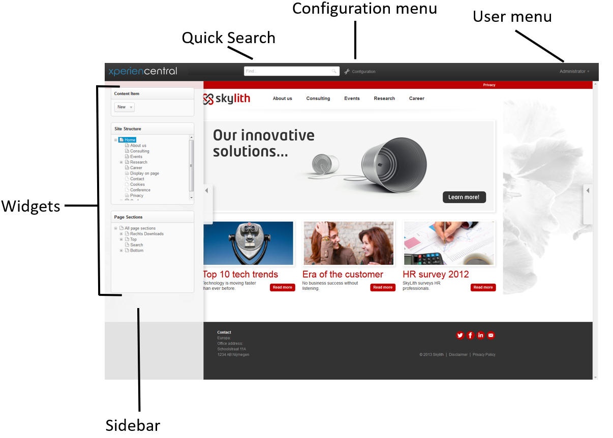
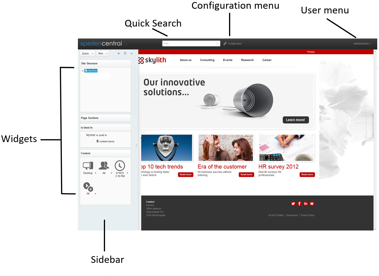
Workspace OverviewThe parts of the Workspace are shown in the figure below:
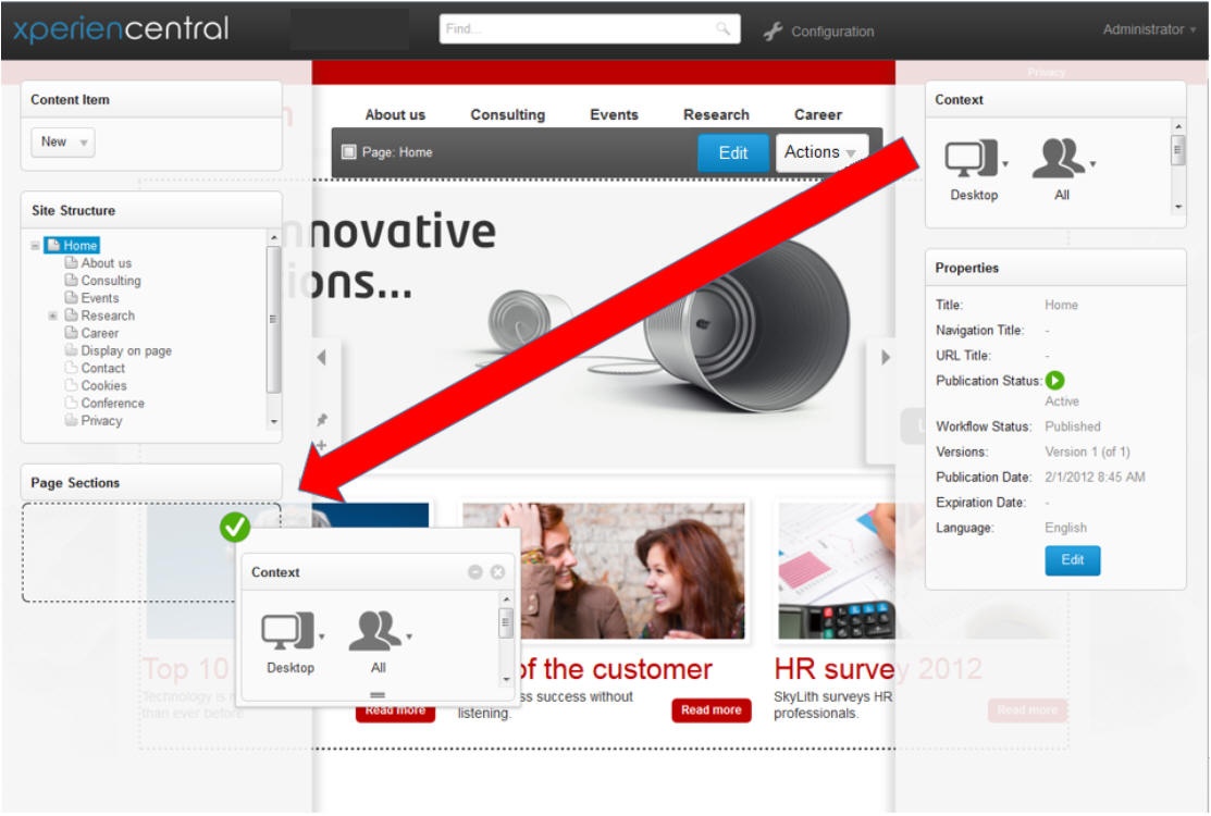
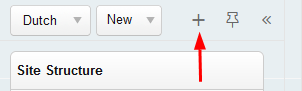
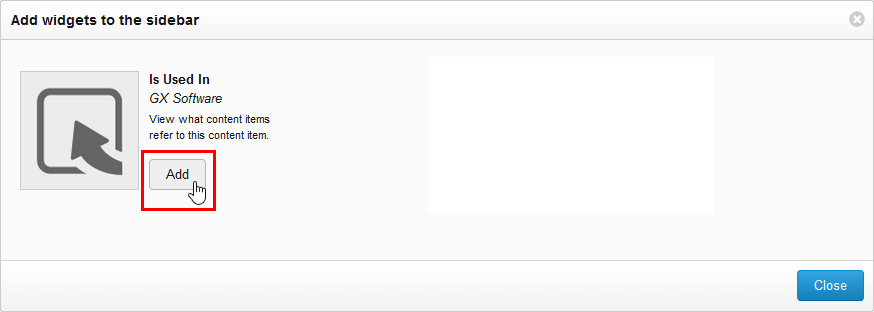
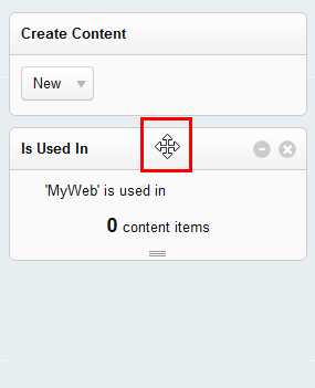
Customizing the SidebarsThe sidebars in the Workspace can be fully customized according to your personal preferences. You can resize the sidebars, add or remove widgets, and arrange the widgets exactly how you want them. The left and right sidebars of the Workspace work exactly the same: Each has a tab containing icons that allow you to minimize and maximize the sidebar, drag and resize the sidebar to your desired width, pin the sidebar to the Workspace, and add widgets. Widgets can also be dragged up and down in the same sidebar in order to rearrange the order in which they appear from top to bottom or you can drag a widget from the left to the right sidebar and vice versa. Adding WidgetsUsing widgets, you interact with the structure of your website, preview content, modify the properties of content items, and can see references between content items. XperienCentral contains seven default widgets that you can add to the Workspace sidebars. Your application manager and developers can develop their own widgets and easily add them to XperienCentral. Contact them for information on using widgets which are custom to your project. Click one of the following for information on the default XperienCentral widgets: To add a widget to a sidebar, follow these steps:
Moving WidgetsThe widgets in the sidebars of your Workspace can be dragged and moved around to suit your preferences at any time. You can arrange the widgets any way you like from top to bottom and you can also drag a widget from one Sidebar to the other. To rearrange widgets within a sidebar, follow these steps:
To move a widget from one sidebar to the other, follow these steps:
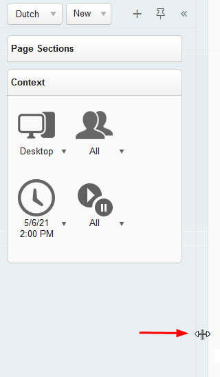
Manually Resizing the SidebarsThe sidebars can be resized to any desired width. This is done by clicking and dragging the Resizer. To resize a sidebar using the Resizer:
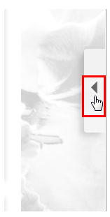
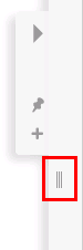
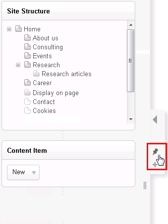
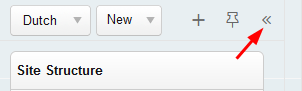
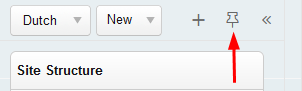
Expanding and Collapsing the SidebarsThe sidebars can be expanded and collapsed with the single click of the mouse. To collapse a sidebar, click the Collapse button in the sidebar's header: Navigating in the SidebarsWhen the sidebar contains more widgets than can be displayed in one view vertically, a scrollbar appears (on the left side of the right sidebar and on the right side of the left sidebar). Drag the scrollbar and down to access the widgets that are out of view. Floating Versus DockedThe sidebars have two modes: floating and docked. In floating mode, content can appear behind the sidebars — the sidebar is partially transparent and the content behind it can be seen. In docked mode, a sidebar claims the part of the screen where it is and content in the content item is adjusted so that all of it remains visible. To switch to docked mode, hover the mouse over the sidebar's header and click the pin icon:
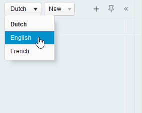
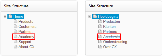
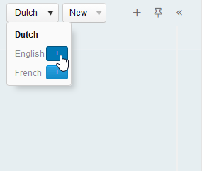
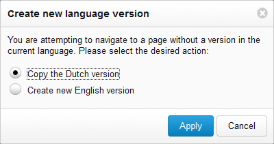
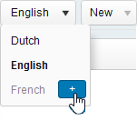
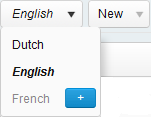
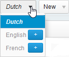
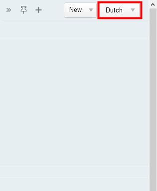
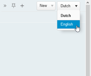
The pin icon turns black and the edge of the sidebar becomes flush with the content. To switch to floating mode, hover the mouse over the sidebar's header and click the black pin icon. The sidebar and the content adjust so that part of it appears behind the sidebar. Switching Between Language VersionsExpand the section below that corresponds to your version of XperienCentral for more information.
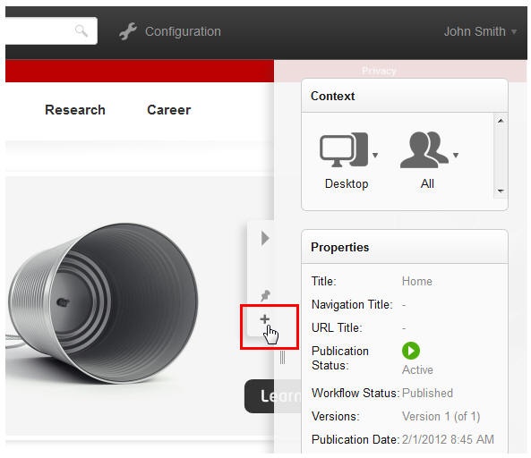
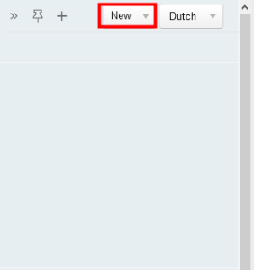
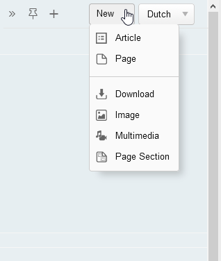
Creating New ContentUsing the Create Content drop-down fixed to the header of each sidebar, you can create new content for your channel(s) (pages, page sections, articles, etc.). For example:
All supported content types can be created quickly and easily using the Create Content drop-down and you can immediately begin adding content to the items you create. With the exception of pages and page sections, all items created with the Create Content drop-down are automatically added to the Content Repository and are therefore universally available to be used in all parts of your channel(s). To create a new content item, expand the drop-down list of available content types and then select the content type you want to create. The new content type will be created and appear in the Editor where you can add content to it and define its properties. The content types described in this topic are the default types available in XperienCentral. If your project has deployed custom content types, they will also be available in the Create Content drop-down. Ask your application manager or main editor if you have questions about using custom content types not described here. To create new content, expand the drop-down list and select the content type to create. For example:
ImageAn image content item contains a graphic that can be displayed on content items in your channel(s). The supported formats are SVG, GIF, BMP, PNG, JPEG and WEBP (versions R36 and
Image Preview and MetadataOnce you add an image, you will see a thumbnail preview as well as the following metadata for it:
Edit Image OptionsOnce a lead image has been added, clicking [Edit Image] gives you the following command options:
PageTo create a new page, select "Page" from the drop-down list. The new page will be a child page of the page that currently has the focus in the Site Structure Widget. ArticleAn article content item can be displayed in a Dynamic Content Overview content element or a Content Overview content element. You add content to an article in exactly the same way that you add content to pages and page sections in the Editor.
| ||||||||||||||||||||||||||||||||||||||||||||||||||||||||||||||||||||||||||||||||||||||||||||||||||||||||||||||||||||||||||||||||||||||||||||||||||||||
| Basic | |
|---|---|
| Property | Description |
| Title | The title of the Download. This is the name that appears in the search results when you search for the Download. |
| Publication Date | The date and time the Publication Status of the download was or will be Active or Planned, depending on the Workflow status. By default, the Publication Date and time is the moment that the download was created. At the same time, the default Workflow Status is Planned which means that the default Publication Status of a newly created download is "Inactive". This prevents a newly created download from being immediately visible. If you change the Publication Date for a download to a future time while its Workflow Status is set to "Published", the Publication Status changes from "Inactive" to "Planned". When the current date and time reaches a download's Publication Date, the Publication Status transitions from "Planned" to "Active". |
| Expiration Date | The date when the Download will expire. |
| Tags | The tags assigned to the Download. |
| Author | The name of the person or entity that added the Download. The author will appear below the link for the Download. |
| Date | Select the date when the Download was added. The date will appear below the link for the Download. This is useful in order to give website visitors an idea of how old the file is. |
| Version | Enter a version number for the Download if you want to distinguish it from other Downloads with the same or similar name. The version will appear below the link for the Download. |
| Personalization | The personalization assigned to the Download. |
| File | The name of the file to be downloaded. To replace the file with another or to delete it, click [Replace File]. |
| Status | |
| Property | Description |
| Publication Status | The following are the possible publication status states:
|
| Workflow Status | The current workflow status of the Download. |
| Created | The date and time the Download was created and the name of the user who created it. |
| Last Modified | The date and time the Download was last modified and the name of the user who modified it. |
| Versions | |
| Shows all the versions of the Download. To navigate to a version, click it in the list. | |
Navigating to Content Items
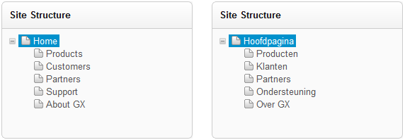
When you create a new content item, it is stored in the Content Repository. To navigate to all content items, see Searching for Content Items. Pages can also be navigated to using the Site Structure Widget and page sections can be navigated to using the Page Sections Widget.
Configuration Menu
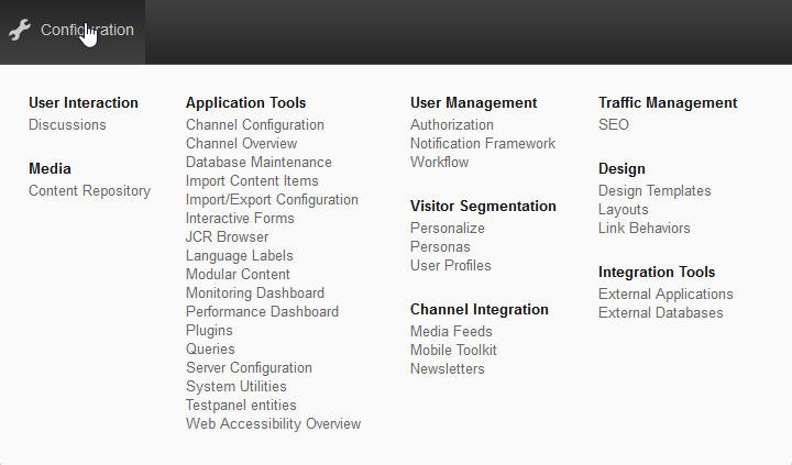
In the top bar of the Workspace there is a link to the XperienCentral Configuration menu. When you click Configuration, a menu appears which contains all the XperienCentral functionality categorized into functional groups.
User Menu
The User menu, located at the top right part of the Workspace, can be accessed by clicking your username. For example:

The drop-down list consists of the following options:
| Option | Description |
|---|---|
| My Settings | Your personal settings for XperienCentral. |
| My Content Items | Shows the content items that you have created and also those created by others which you have the right to modify. |
| About XperienCentral | Displays information about the version of XperienCentral that you are using. |
| Logout | Logs you out of XperienCentral. |
| HTML |
|---|
<br /><br /><br /><br /> |
| Expand | ||||||||||||||||
|---|---|---|---|---|---|---|---|---|---|---|---|---|---|---|---|---|
| ||||||||||||||||
In This Topic
Workspace OverviewThe parts of the Workspace are shown in the figure below:
Customizing the SidebarsThe sidebars in the Workspace can be fully customized according to your personal preferences. You can resize the sidebars, add or remove widgets, and arrange the widgets exactly how you want them. The left and right sidebars of the Workspace work exactly the same: Each has a tab containing icons that allow you to minimize and maximize the sidebar, drag and resize the sidebar to your desired width, pin the sidebar to the Workspace, and add widgets. Widgets can also be dragged up and down in the same sidebar in order to rearrange the order in which they appear from top to bottom or you can drag a widget from the left to the right sidebar and vice versa. Adding WidgetsUsing widgets, you interact with the structure of your website, preview content, modify the properties of content items, and can see references between content items. XperienCentral contains seven default widgets that you can add to the Workspace sidebars. Your application manager and developers can develop their own widgets and easily add them to XperienCentral. Contact them for information on using widgets which are custom to your project. Click one of the following for information on the default XperienCentral widgets:
To add a widget to a sidebar, follow these steps:
Moving WidgetsThe widgets in the sidebars of your Workspace can be dragged and moved around to suit your preferences at any time. You can arrange the widgets any way you like from top to bottom and you can also drag a widget from one Sidebar to the other. To rearrange widgets within a sidebar, follow these steps:
To move a widget from one sidebar to the other, follow these steps:
Manually Resizing the SidebarsThe sidebars can be resized to any desired width. This is done by clicking and dragging the Resizer. To resize a sidebar using the Resizer:
Expanding and Collapsing the SidebarsThe sidebars can be expanded and collapsed with the single click of the mouse. To collapse a sidebar, click the Collapse button in the sidebar's anchor. The sidebar collapses. To expand a sidebar, click the expand button in the sidebar's anchor. The sidebar expands. Navigating in the SidebarsWhen the sidebar contains more widgets than can be displayed in one view vertically, a scrollbar appears (on the left side of the right sidebar and on the right side of the left sidebar). Drag the scrollbar and down to access the widgets that are out of view. Floating Versus DockedThe sidebars have two modes: floating and docked. In floating mode, content can appear behind the sidebars — the sidebar is partially transparent and the content behind it can be seen. In docked mode, a sidebar claims the part of the screen where it is and content in the content item is adjusted so that all of it remains visible. To switch to docked mode, hover the mouse over the sidebar's tab (right of the left sidebar and left of the right sidebar) and click the pin icon. The tab disappears and the edge of the sidebar is flush to the content. To switch to floating mode, hover the mouse over the sidebar's tab (right of the left sidebar and left of the right sidebar) and click the pin icon. The sidebar tab appears and the content adjusts so that part of it appears behind the sidebar.
Configuration MenuIn the top bar of the Workspace there is a link to the XperienCentral Configuration menu. When you click Configuration, a menu appears which contains all the XperienCentral functionality categorized into functional groups.
User MenuThe User menu, located at the top right part of the Workspace, can be accessed by clicking your username. For example:
The drop-down list consists of the following options:
|