...
| Table of Contents | ||||
|---|---|---|---|---|
|
...
XperienCentral Users
Designing usable functionality starts with knowing the (future) users of it. Most XperienCentral users are no computer cracks, like most developers arenot programming experts. Developers should take that this into account when developing new functionality. The typical users of XperienCentral can be divided into six groups: casual users, editors, system application managers, administrators, developers and website visitors. Each group performs its own different tasks within the application and outside, using specific skills and knowledge. In the real world these different roles are not so strictly parteddivided; a single person can perform multiple roles simultaneously or tasks can be divided between multiple roles. These six profiles are intended to help developers in getting get a general impression of the different users of the application.
...
The most important group of users is the casual users, not only because this group is the largest, but also because entering and editing content is the main task that is performed within XperienCentral. Most functionality within the application focuses on entering or editing content (text, images or any other media), which are the main tasks of the casual user. Editors are no all-round computer experts, although they may spend most of their working time using one. They are used to browsing the internet gathering information on their subjects. Microsoft Word is their most important tool for writing and these users are real experts in it. This expertise in Microsoft Word and familiarity with the internet were important starting points in determining the GUI basics of XperienCentral.
Editor
Main task: Managing and editing content
...
The editor is the person that manages all content that is entered by casual users and others. He or she decides what is published, when it is published and in what form. The editor is the person with knowledge of the target audience and is responsible for the form and content of the frontend, usually a website. Editors use XperienCentral to manage, edit and publish content which means that they typically use a lot more functionality within XperienCentral than the casual user.
...
Application Manager
Main task: Setting up and configuring XperienCentral applications
Knowledge: XperienCentral, software (general), technology and engineering
Skills: Technical
The system application manager is responsible for setting up and configuring XperienCentral according to the needs and wishes of the client. He or she has a broad knowledge of the XperienCentral framework and application in addition to his or her general knowledge of software technology. The system application manager gets clients up and running with their XperienCentral installation. Typically he or she is an employee of or an implementation partner of GX Software.
...
The most basic end user of XperienCentral is the visitor to the website that is managed by the application. This may seem like an unimportant user because he or she will not use or see anything of the XperienCentral application, however the visitor has some of the most important demands of all users such as feature richness, speed and reliability of the system.
...
Background of the XperienCentral GUI
...
Adding new functionality to XperienCentral using plugins doesn’t mean that a developer has to re-invent the graphical user interface every time a panel or content element is added to the application. A set of standard GUI elements is already available for the developer to use for new functional GUIs. This makes the development of new functionality easier and it also ensures a consistent look and feel within XperienCentral, which is important for the users of the application.
...
GUI Elements
All standard GUI elements are centrally styled using CSS which means that developers don’t have to add CSS classes themselves as long as they use the standard GUI elements and (in some cases) apply the right CSS classes to them or their containing HTML element. The following overview lists the standard GUI elements along with a short description of the element. The numbers map to the previous two images, which show examples of the standard GUI elements. Some of the GUI elements are to be used in panels only - this is indicated in the list by an asterisk.
It is possible that a new plugin functionality requires a GUI element that is not in the list below. In that case, the GUI element should be designed to fit in this range.
| GUI Element | Description |
|---|---|
| 1 - Title* | Describes the function of the panel. |
2 - Horizontal tabs (first level)* | Default first level navigation. Tabs are ordered logically from left to right, e.g. a sequence of steps in a workflow. |
| 3 - Vertical tabs | Indicates whether this permission category appears in the web initiative configuration panel of the Workspace. If it is visible, the plugin as a whole can be enabled/disabled per web initiative. |
| 4 - Horizontal tabs (second level)* | Second level navigation. |
| 5 - Field sets* | Used for grouping input elements. Field sets preferably use a title (legend) to label their content. |
| 6 - Label | Descriptive label for input elements. |
| 7 - Text field | Used for user input of short string values. |
| 8 - Date field | User input for dates. Consists of a text field with a button that invokes a date picker. |
| 9 - File field | User input for files. Displays a text field with a button that invokes the systems file dialog. |
| 10 - Text area | Used for user input of long string values. |
| 11 - Drop-down list | Used for user input of a single selection from a list of options, for example the position of an item in a list. |
| 12 - Checkbox | Used for user input of a boolean value. |
| 13 - Radio buttons | Used for user input of a single selection from a small number of options. |
| 14 - Regular buttons | Used for miscellaneous actions, for example creating a new instance of an object. |
| 15 - Data grid | Used for listing multiple instances, possibly multi-column and sortable. |
| 16 - Bottom bar buttons | Used for the main controls of the panel, for example [OK], [Close], and so forth. These buttons always appear in the bottom right-hand portion of the panel and are larger than the regular buttons. |
* The GUI element should not be used in a content element
...
Layout
The CSS will ensure the proper layout of the input elements within forms or grids, like the contents of a tab pane or the input elements within a custom content element. A grid based layout helps the user to ‘read’ the GUI. If all input elements were just randomly scattered across the panel or content element the focus of the user would just bounce from element to element trying to find some logical structure or hierarchy.
Layout of the input elements is done in HTML by the use of tables. By assigning the ‘widgetgrid’ class to the table the input elements are in, specifying column widths and giving all table cells the proper classes (according to their content) will ensure a proper layout. The class needs to be assigned to the TD element containing the GUI element, not to the input element itself. This is because the input elements inside a TD element with a class are horizontally scaled to fit their container. That means that the input elements automatically resize to the width of their parent TD. This can lead to unexpected and undesirable results when the width of the TD (or the width of the whole column or table) is not specified.
| Code Block | ||
|---|---|---|
| ||
<table class="widgetgrid" width="100%">
   <col width="20%" />
   <col width="40%" />
   <col width="40%" />
   <tr>
      <td class="label">Label 1:</td>
      <td class="textfield"><input type="text" name="texfield01" /></td>
      <td class="text">(Some help text)</td>
   </tr>
   <tr>
      <td class="label">Label 2:</td>
      <td class="textfield"><input type="text" name="texfield02" /></td>
      <td />
   </tr>
</table>
|
An exception to this automatic scaling is the file input field in Mozilla browsers. To horizontally scale this input element in Firefox, the parameter size should be added, for example size="40".
...
CSS Classes
There are several CSS classes a developer can use to define the layout of input elements. Applying the wrong class to a certain input element (or its container), or omitting the use of classes can lead to unexpected results. For a consistent look and feel throughout the application, it is recommended that you do not use inline layout tags, like <b>, <i> or <font>. Using inline CSS markup is also discouraged.
| TD Class Name | Description |
|---|---|
| Labels of input fields (align right, default) |
| Labels of input fields (align left) |
| Headings (align left) |
| Plain texts |
| Text type INPUT elements |
| Date type INPUT elements (contents do not scale to fit) |
| TEXTAREA elements (contents scale vertically as well as horizontally, so a height should be set on a <TD> element) |
| SELECT elements |
| SELECT elements with size > 1 |
| Checkbox type INPUT elements |
| Radio type INPUT elements |
| Button type INPUT elements |
| File type INPUT elements (Mozilla browsers need a "size" parameter to control the width of this INPUT element) |
| Nested table element for cell-specific layout |
| For presentation of data (creates a boxed area) |
| Horizontal rules |
| Empty cell used for creating space between two separate rows |
...
Layout Examples
In this part a few basic examples of different layouts will be outlined and explained. These examples can be used for developing new plugin panels or content elements. They are meant to describe the layout of input elements by tables. The table grids are merely a schematic representation of the actual grid design. Text labels are used in the grids to hint the contents of table cells. When no text label is present the cell should be considered empty. In the code example the HTML markup for the input elements themselves is omitted because the focus is on grid layout, not on content.
Basic Layout
The following basic layout:
Label 1 | Text field 1 | |||
Label 2 | Checkbox 1 |
| ||
Checkbox 2 | ||||
Label 3 | Drop-down list 1 | |||
Label 4 | Radio button 1 | Radio button 2 |
...
Is rendered using the following HTML markup:
| Code Block | ||
|---|---|---|
| ||
<table class="widgetgrid" width="100%">
    <col width="20%" />
    <col width="40%" />
    <col width="40%" />
    <tr>
        <td class="label">Label 1</td>
        <td class="textfield">Textfield 1</td>
        <td />
    </tr>
    <tr>
        <td class="label">Label 2</td>
        <td class="checkbox">Checkbox 1</td>
        <td />
    </tr>
    <tr>
        <td />
        <td class="checkbox">Checkbox 2</td>
        <td />
    </tr>
    <tr>
        <td class="label">Label 3</td>
        <td class="checkbox">Drop-down list 1</td>
        <td />
    </tr>
    <tr>
        <td class="label">Label 4</td>
        <td class="radio">Radiobutton 1</td>
        <td class="radio">Radiobutton 2</td>
    </tr>
</table>
|
The example above is a very basic table layout without any spanning or nesting. The first column contains all the labels for the input elements, the second column contains the input elements themselves and the third column is empty for all but the last row. In this case, the empty cells in the third column prevent the text field and the drop-down list from displaying too large. The width and height of these input elements are determined by their container, that is, the table cell. Notice how the <COL> tags determine the width of the columns. Using these <col> tags is a lot easier than adding a width parameter to every single cell.
Layout Using Column Spanning
The following basic layout:
Label 1 | Text field 1 | |||
Label 2 | Text area 1 | |||
Label 3 | Radio button 1 | Radio button 2 | ||
Is rendered using the following HTML markup:
| Code Block | ||
|---|---|---|
| ||
<table class="widgetgrid" width="100%">
    <col width="20%" />
    <col width="40%" />
    <col width="40%" />
    <tr>
        <td class="label">Label 1</td>
        <td class="textfield">Textfield 1</td>
        <td />
    </tr>
    <tr>
        <td class="label">Label 2</td>
        <td class="textarea" colspan="2" height="80">Textarea 1</td>
    </tr>
    <tr>
        <td class="label">Label 3</td>
        <td class="radio">Radiobutton 1</td>
        <td class="radio">Radiobutton 2</td>
    </tr>
</table>
|
In this example column spanning is used to make a text area step out of the regular grid layout and span across two columns by adding the colspan property to the containing <td> tag. Notice that as a result in the row with the colspan there are only two <td> elements instead of three. Also notice the height parameter of the <td> element containing the text area - this is because the text area needs to be higher than a regular row and vertically scales to 100% of its container.
Layout Using Row Spanning
...
Label 1 | Text field 1 | ||
Label 2 |
Text area 1 | Checkbox 1 | |
| Checkbox 2 | ||
| Checkbox 3 | ||
Label 3 | Radio button 1 | Radio button 2 |
Is rendered using the following HTML markup:
| Code Block | ||
|---|---|---|
| ||
<table class="widgetgrid" width="100%">
    <col width="20%" />
    <col width="60%" />
    <col width="20%" />
    <tr>
        <td class="label">Label 1</td>
        <td class="textfield">Textfield 1</td>
        <td />
    </tr>
    <tr>
        <td class="label">Label 2</td>
        <td class="textarea" rowspan="3">Textarea 1</td>
        <td class="checkbox">Checkbox 1</td>
    </tr>
    <tr>
        <td />
        <td class="checkbox">Checkbox 2</td>
    </tr>
    <tr>
        <td />
        <td class="checkbox">Checkbox 3</td>
    </tr>
    <tr>
        <td class="label">Label 3</td>
        <td class="radio">Radiobutton 1</td>
        <td class="radio">Radiobutton 2</td>
    </tr>
</table>
|
Row spanning is less common than column spanning because in most cases it’s possible to achieve the layout within one ordinary row. In cases like the one in this example, row spanning is needed because the row separation is still needed in another column. Notice that after the rowspan property in the successive rows the spanned <td> element is omitted, resulting in <tr> elements with only two <td> elements in them (representing first and third column).
Layout Using Table Nesting
...
Label 1 | Text field 1 | |||||||||||
Label 2 |
| |||||||||||
Label 3 | Drop-down list 1 | |||||||||||
...
Is rendered using the following HTML markup:
| Code Block | ||
|---|---|---|
| ||
<table class="widgetgrid" width="100%">
    <col width="20%" />
    <col width="60%" />
    <col width="20%" />
    <tr>
        <td class="label">Label 1</td>
        <td class="textfield">Textfield 1</td>
        <td />
    </tr>
    <tr>
        <td class="label">Label 2</td>
        <td class="presentation" colspan="2">
<table class="widgetgrid" width="100%">
    <col width="40%" />
    <col width="30%" />
    <col width="30%" />
    <tr>
        <td class="heading">Header 1</td>
        <td class="heading">Header 2</td>
        <td class="heading">Header 3</td>
    </tr>
    <tr>
        <td class="text">Value 1a</td>
        <td class="text">Value 2a</td>
        <td class="text">Value 3a</td>
    </tr>
    <tr>
        <td class="text">Value 1b</td>
        <td class="text">Value 2b</td>
        <td class="text">Value 3b</td>
    </tr>
</table>
        </td>
    </tr>
    <tr>
        <td />
        <td class="checkbox">Checkbox 2</td>
    </tr>
    <tr>
        <td />
        <td class="checkbox">Checkbox 3</td>
    </tr>
    <tr>
        <td class="label">Label 3</td>
        <td class="radio">Radiobutton 1</td>
        <td class="radio">Radiobutton 2</td>
    </tr>
</table>
|
...
Table nesting allows complicated and dynamic layouts, but it also makes the HTML structure more complicated. If possible, table nesting should be avoided and column or row spanning should be used instead. For various reasons, that will sometimes not be possible. A typical example of the use of nested tables is when the result of some query with an unknown number of results is shown in a tabular layout inside the main grid layout.
...
GUI Guidelines
To ensure a good user experience within the application, XperienCentral developers should design the graphical user interface of new functionality according to the guidelines outlined in this part. Note that they are referred to a guidelines as opposed to rules. This is because it simply isn’t possible to create a set of rules that, when strictly followed, will guarantee a good user experience in every situation.
...
The user usually doesn’t know, and in most cases doesn’t want to know, about the technical implications that his actions will have in the backend of the application. To the regular user, it is irrelevant how the application accomplishes its tasks. Their only concern is that it will do what needs to be done, preferably without too much hassle, therefore the backend should be hidden as much as possible from the user without taking control out of their hands. This also means avoiding technical terminology in the GUI, for example, labels like "Create new instance" for adding a new product to the products database even though this is technically what is being done. Be straightforward and succinct.
...
Tabs and Wizards: Splitting up Tasks
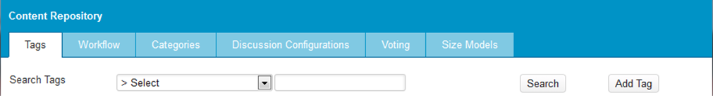
Tabs are typically used in panels that contain a lot of information and/or controls. Tabs are not commonly used in content elements. By splitting things up into logical parts and assigning these to the different tabs, the user will be able to find the information or controls he needs more easily. It is important that this division creates a structure that the user can understand and that it is logical and practical for him or her to be able to performing tasks. Vertical tabs are typically used when the first level tabs represent different objects instead of different aspects of the same object. Choosing the right text labels (and icons, in the case of vertical tabs) for the tabs is obviously crucial. The left-right or top-down order of the tabs can also help the user in understanding the logic of the functionality. For instance, the tabs can be ordered as successive steps in a certain workflow or as drill-down levels with an increasing level of detail. Multiple levels of tabs are sometimes helpful, but it could also make the structure of information and controls complicated and or convoluted and therefore more difficult to use. Try to limit the number of tabs to a reasonable amount. A general rule of thumb is to limit the number of tabs to a maximum of 7 (per level). The following is an example of a panel containing a logical tab structure:
Another way of splitting information input into logical steps is by using a wizard flow. In a wizard, the user is confronted with only one or a few input elements at a time, which makes it easier to use. There are no tabs and preferably no other kind of grouping of input elements within the steps, because each step handles only one setting or choice. This choice could be presented using any input element or group of input elements available. It’s possible to use various alternate paths in a wizard, for example, "When user selects option X, go to step 2 - when user selects option Y, go to step 5").
...
A wizard is great for complicated settings or configurations that the user doesn’t encounter very often or upon initial setup. It’s less suitable for functionality the user often needs because it slows the advanced user down - tabs are more suitable in such circumstances.
...
Field Sets, Horizontal Rules and Whitespace
While tabs and wizards are used to split information into manageable chunks, field sets group separate elements, like labels and controls in order to render the functional structure of a GUI. Field sets typically have a title (called "legend") that summarizes the functional role of the elements or the action to be performed in that group. As with tabs, try to limit the number of field sets per panel or content element to a reasonable amount. Using too many field sets has the same result as using no field sets at all. The same goes for the nesting of field sets which should be avoided. Field sets are not commonly used in content elements because the space in a content element is limited and the extra lines of the field set create more visual noise. The following is an example of a fieldset in a panel:
| Code Block | ||
|---|---|---|
| ||
<fieldset>
    <legend>fieldset 1</legend>
    <table class="widgetgrid" width="100%">
        <col width="20%" />
    <col width="20%" />
        <col width="20%" />
        <col width="40%" />
        <tr>
            <td class="label">Label 1:</td>
            <td class="textfield" colspan="2">
                <input type="text" name="textfield01" /></td>
            <td />
        </tr>
    <tr>
            <td class="label">Label 2:</td>
            <td class="radio">
                <input type="radio" name="radiogroup1" id="option1" />
                <label for="option1">Option 1</label>
            </td>
            <td class="radio">
                <input type="radio" name="radiogroup1" id="option2" />
                <label for="option2">Option 2</label>
            </td>
            <td class="radio">
                <input type="radio" name="radiogroup1" id="option3" />
                <label for="option3">Option 3</label>
            </td>
        </tr>
    </table>
</fieldset>
|
...
Horizontal Rules
Horizontal rules (an <hr> element inside a <td> with class="hr") and whitespaces (an empty <td> element with class="splitterrow") can also be used to divide information into logical parts:
| Code Block | ||
|---|---|---|
| ||
<table class="widgetgrid" width="100%">
    <col width="20%" />
<col width="40%" />
    <col width="40%" />
    <tr>
        <td class="label">Title:</td>
        <td class="textfield"><input type="text" name="textfield01" /></td>
        <td />
    </tr>
<tr>
        <td class="label">Subtitle:</td>
        <td class="textfield"><input type="text" name="textfield02" /></td>
        <td />
    </tr>
    <tr>
        <td class="splitterrow" colspan="3" />
    </tr>
    <tr>
        <td class="label">Description:</td>
        <td class="textfield" colspan="2"><input type="text" name="textfield03" /></td>
    </tr>
</table>
|
...
...
Tagging Elements: Labels and Headings
...
The following is an example of a default label:
| Code Block | ||
|---|---|---|
| ||
<table class="widgetgrid" width="100%">
    <col width="20%" />
<col width="80%" />
    <tr>
        <td class="label">Title:</td>
        <td class="textfield"><input type="text" name="textfield01" /></td>
    </tr>
</table>
|
The following is an example of a non-default label:
| Code Block | ||
|---|---|---|
| ||
<table class="widgetgrid" width="100%">
    <col width="20%" />
<col width="80%" />
    <tr>
        <td class="label_left" colspan="2">Title:</td>
    </tr>
    <tr>
        <td class="textarea" colspan="2" height="80">
            <textarea name="textfield01">Lorum ipsum</textarea>
        </td>
    </tr>
</table>
|
...
Headings are less often used in both panels as content elements because labeling a group of input elements is most likely done by the legend of the field set the input elements are in. Headings should only be used if it is really necessary to explicitly label a group of input elements and only if the use of a fieldset is impossible.
The following is an HTML example of a heading:
| Code Block | ||
|---|---|---|
| ||
<table class="widgetgrid" width="100%">
    <col width="50%" />
<col width="50%" />
    <tr>
        <td class="heading" colspan="2">Group 1</td>
    </tr>
    <tr>
        <td class="presentation">
<table class="widgetgrid" width="100%">
    <col width="20%" />
<col width="80%" />
    <tr>
        <td class="label">Title:</td>
        <td class="textfield"><input type="text" name="textfield01" /></td>
    </tr>
<tr>
        <td class="label">Subtitle:</td>
        <td class="textfield"><input type="text" name="textfield02" /></td>
    </tr>
</table>
        </td>
        <td />
    </tr>
    <tr>
        <td class="heading" colspan="2">Group 2</td>
    </tr>
    <tr>
        <td class="presentation">
<table class="widgetgrid" width="100%">
    <col width="20%" />
<col width="80%" />
    <tr>
        <td class="label">Title:</td>
        <td class="textfield"><input type="text" name="textfield03" /></td>
    </tr>
<tr>
        <td class="label">Subtitle:</td>
        <td class="textfield"><input type="text" name="textfield04" /></td>
    </tr>
</table>
        </td>
        <td />
    </tr>
</table>
|
...
Choices: Checkboxes, Radio Buttons and Drop-down Lists
...
The following HTML creates a group of checkboxes:
| Code Block | ||
|---|---|---|
| ||
<table class="widgetgrid" width="100%">
    <col width="20%" />
    <col width="40%" />
    <col width="40%" />
    <tr>
        <td class="label">Title:</td>
        <td class="checkbox">
            <input type="checkbox" name="checkbox01" id="checkbox01" />
            <label for="checkbox01">Option 1</label>
        </td>
        <td />
    </tr>
    <tr>
        <td />
        <td class="checkbox">
            <input type="checkbox" name="checkbox02" id="checkbox02" />
        <label for="checkbox02">Option 2</label>
        </td>
        <td />
    </tr>
    <tr>
        <td />
        <td class="checkbox">
            <input type="checkbox" name="checkbox03" id="checkbox03" />
        <label for="checkbox03">Option 3</label>
        </td>
        <td />
    </tr>
</table>
|
...
Checkboxes and Radio Buttons
...
The following HTML creates a set of horizontally aligned radio buttons:
| Code Block | ||
|---|---|---|
| ||
<table class="widgetgrid" width="100%">
    <col width="20%" />
<col width="20%" />
<col width="20%" />
    <col width="20%" />
<col width="20%" />
    <tr>
        <td class="label">RadioGroup01:</td>
        <td class="radio">
            <input type="radio" name="radiogroup01" id="radio01" />
            <label for="radio01">Option 1</label>
        </td>
        <td class="radio">
            <input type="radio" name="radiogroup01" id="radio02" />
            <label for="radio02">Option 2</label>
        </td>
        <td class="radio">
            <input type="radio" name="radiogroup01" id="radio03" />
            <label for="radio03">Option 3</label>
        </td>
    </tr>
</table>
|
...
Drop-down Lists
Drop-down lists can be used in various ways. Typically they are used to offer a large range of choices. The range may include the option "none" if case user input isn’t required. Oftentimes when "none" is an option, it is set to the default option. If user input is required because "none" is not an accepted value, the initial value should be the first option in the list. If the chance of the user forgetting to select an option needs to be ruled out, a dummy option like "Select" can be used. If you choose for the latter, a validation should be performed that checks whether the user has actually selected an acceptable value before processing the data. All of these drop-down lists have a separate label to the left.
...
The following HTML creates a drop-down list:
| Code Block | ||
|---|---|---|
| ||
<table class="widgetgrid" width="100%">
    <col width="20%" />
<col width="40%" />
<col width=”40%” />
    <tr>
        <td class=”label”>Label 1:</td>
        <td class=”textfield”><input type=”text” name=”textfield01” /></td>
        <td />
    </tr>
    <tr>
        <td class=”label”>Label 2:</td>
        <td class=”pulldown”>
            <select name=”select01”>
                <option>Option 1</option>
                <option>Option 2</option>
                <option>Option 3</option>
                <option>Option 4</option>
                <option>Option 5</option>
            </select>
        </td>
        <td />
    </tr>
</table>
|
...
...
Multi-line Text Input: Text Areas
...
The following HTML creates a text area:
| Code Block | ||
|---|---|---|
| ||
<table class=”widgetgrid” width=”100%”>
    <col width=”20%” />
<col width=”80%” />
    <tr>
        <td class=”label”>Title:</td>
        <td class=”textarea” height=”80”>
            <textarea name=”textarea01”>Lorum ipsum</textarea>
        </td>
    </tr>
</table>
|
...
...
Date Input: Date Fields
Providing a user friendly way to input a date can be done by using the date field. The date field is a regular text field with a button next to it that opens a calendar widget which the user can use to select a date. By using the widget, the user doesn’t need to worry about entering the date in the correct format because this is done automatically. Users can still manually enter the date into the text field if they want to. The text field with its button is not scaled in any direction within the table.
The following HTML creates a date field:
| Code Block | ||
|---|---|---|
| ||
<table class=”widgetgrid” width=”100%”>
    <col width=”15%” />
    <col width=”5%” />
    <col width=”40%” />
    <col width=”5%” />
    <col width=”10%” />
    <col width=”25%” />
    <tr>
        <td class="label">Label05:</td>
        <td class="radio">
            <input type=”radio” name=”radiogroup1” id=”radio1” />
            <label for=”radio1”>From</label>
        </td>
        <td class="datefield">
            <input type="text" size="10" />
            <a href="#"><img border="0" src="btn_date2_up.gif"/></a>
        </td>
        <td class="radio">
            <input type=”radio” name=”radiogroup1” id=”radio2” />
            <label for=”radio2”>Last</label>
        </td>
        <td class="textfield">
            <input type="text" name=”textfield01” />
        </td>
        <td class=”text”>entries</td>
    </tr>
    <tr>
        <td />
        <td class="label">to</td>
        <td class="datefield">
            <input type="text" size="10" />
            <a href="#"><img border="0" src="btn_date2_up.gif"/></a>
        </td>
        <td />
        <td />
        <td />
    </tr>
</table>
|
...
...
Initiating Action: Buttons
...
The following HTML creates an inline button:
| Code Block | ||
|---|---|---|
| ||
<table class=”widgetgrid” width=”100%”>
    <col width=”20%” />
<col width=”40%” />
<col width=”40%” />
    <tr>
        <td class=”label”>Label 1:</td>
        <td class=”pulldown”>
            <select name=”select01”>
                <option>Option 1</option>
                <option>Option 2</option>
                <option>Option 3</option>
                <option>Option 4</option>
                <option>Option 5</option>
            </select>
        </td>
        <td class=”button”><input type=”button” value=”Button label 1” /></td>
    </tr>
</table>
|
...
Uploading Files: File Fields
...
The following HTML creates a file field:
| Code Block | ||
|---|---|---|
| ||
<table class=”widgetgrid” width=”100%”>
    <col width=”20%” />
<col width=”40%” />
<col width=”40%” />
    <tr>
        <td class=”label”>Label 1:</td>
        <td class=”file”>
            <input type=”file” name=”filefield01” size=”40” />
        </td>
        <td />
    </tr>
</table>
|
...
...
Presenting Data: Tables and Grids
...
The following HTML creates a search results table, which can be embedded in a table:
| Code Block | ||
|---|---|---|
| ||
<fieldset>
<legend>fieldset01</legend>
<div class=”searchresults”>
        <table width=”100%”>
            <col width=”20%” />
            <col width=”40%” />
            <col width=”40%” />
            <tr>
                <th>header01</th>
                <th>header02</th>
                <th>header03</th>
            </tr>
            <tr class=”even”>
                <td>Value01</td>
                <td>Value02</td>
                <td>Value03</td>
            </tr>
            <tr class=”odd”>
                <td>Value04</td>
                <td>Value05</td>
                <td>Value06</td>
            </tr>
            <tr class=”even”>
                <td>Value07</td>
                <td>Value08</td>
                <td>Value09</td>
            </tr>
        </table>
    </div>
</fieldset>
|
...
The following HTML creates a presentation table in a content element:
| Code Block | ||
|---|---|---|
| ||
<table class=”widgetgrid” width=”100%”>
    <col width=”20%” />
    <col width=”80%” />
    <tr>
        <td class=”label”>Products:</td>
        <td class=”presentation”>
            <table class=”widgetgrid” width=”100%”>
                <col width=”20%” />
                <col width=”35%” />
                <col width=”45%” />
                <tr>
                    <td class=”heading”>header01</td>
                    <td class=”heading”>header02</td>
                    <td class=”heading”>header03</td>
                </tr>
                <tr>
                    <td class=”text”>value01</td>
                    <td class=”text”>value02</td>
                    <td class=”text”>value03</td>
                </tr>
                <tr>
                    <td class=”text”>value04</td>
                    <td class=”text”>value05</td>
                    <td class=”text”>value06</td>
                </tr>
                <tr>
                    <td class=”text”>value07</td>
                    <td class=”text”>value08</td>
                    <td class=”text”>value09</td>
                </tr>
            </table>
        </td>
    </tr>
</table>
|
...
Lists should not contain too many items because that will make it hard to locate the item(s) the user needs. When a list could be potentially very long, it’s better to add some sort of pagination or search/filter functionality.
...
Tag Library
| Anchor | ||||
|---|---|---|---|---|
|
...
Attributes | Accepts dynamic attributes. |
| Parameters |
|
Example |
|
...
...
Interaction Patterns
In XperienCentral there are several recurring interaction patterns that make the application more consistent and more predictable for the user. As stated before in the guidelines, it is impossible to create a set of patterns that suit the needs of all developers in all situations. For the basic interactions like adding, editing and removing instances, the following patterns outline the interaction concepts.
...
To apply changes made in a panel, the user clicks the [Apply] button. To close a panel, the user clicks [Close]. The [Apply] button is always the left-most of the buttons in the bottom bar of the panel. The [Close]’ button is always the furthest right button.