Forms consist of one or more steps, each of which contains form elements. The form elements are the basis of the form's interface. By default, Interactive Forms contains eighteen elements that you can use to build the interface of each step in a form. In addition to the form elements, there are also Handlers, Prehandlers, and Routers that you can define that can execute actions based on what a visitor enters in a form step.
The number of form elements can also be extended by a developer to offer more form options. This section only describes the use of the default Interactive Forms form elements.
In This Topic
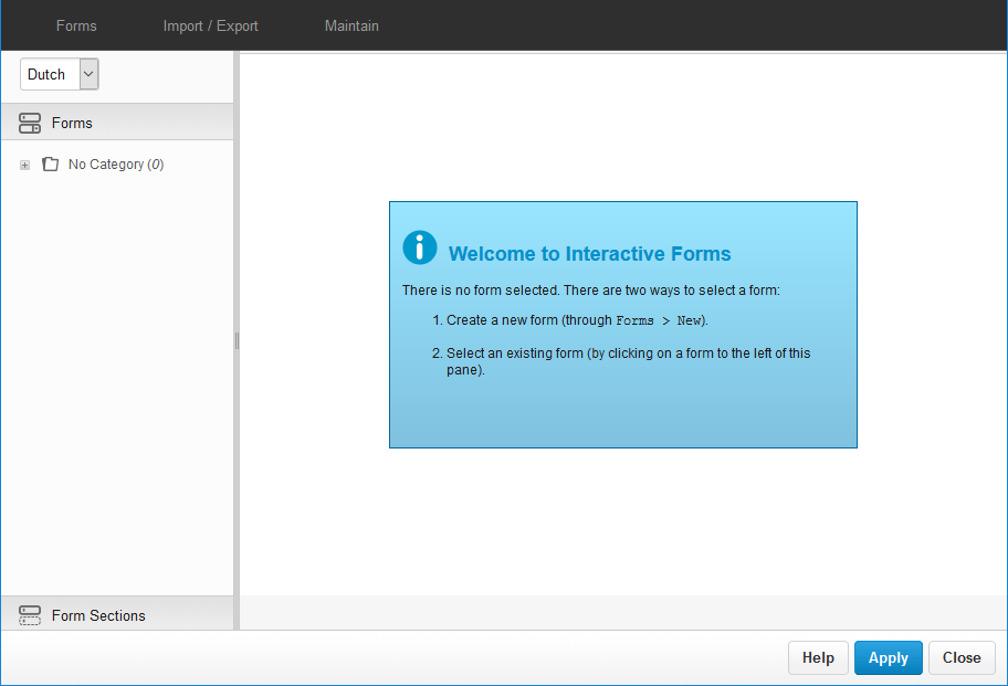
Opening Interactive Forms
Forms in XperienCentral are created using the Interactive Forms component. To open the Interactive Forms user interface, navigate to Configuration > Interactive Forms.
The Interactive Forms user interface consists of the following parts:
The "Forms" menu contains commands for managing forms;
- Drop-down list for selecting the set language version of the form.
- The "Forms" pane where all forms and categories are shown.
- The categories in which forms are organized.
- The "Form Sections" pane where all the form sections and categories are shown.
To create a new form, follow these steps, navigate to Forms > New.
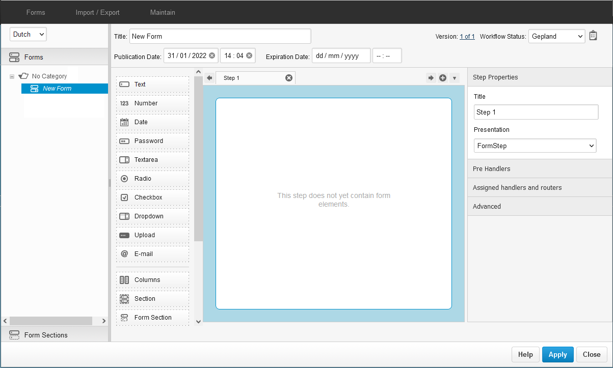
The "Forms" interface consists of the following parts:
- The title of the form. This is the title of the form as it appears in the "Forms" pane.
- Palette containing the form elements used in steps to define the content of the form.
- The step pane in which form elements are arranged.
- The version of the form you are viewing.
- The state of the form. There are three possible states: Development, Active, and Inactive.
- The title of the step.
- Toggle between showing all or a subset of form element properties.
Changing the Title of an Interactive Form
- Highlight "New Form" in the "Title" text box.
- Enter a title for the form.
- Click [Apply] or press <Alt-S>. Notice that the title of the form is now reflected in the "Forms" pane.
Adding Form Elements to a Step
Each step in a form contains one or more form elements. The form elements are the basis of the interface of the form with which the website visitor interacts. After initially creating a new form, the first step contains no form elements and is blank. Proceed as follows:
- In the "Step Properties" section, highlight "Step 1" in the "Title" text box.
- Enter a new title for the step.
- Click [Apply] or press <Alt-S>. Notice that the title of the step is now reflected in the title of the step tab.
The construction of the interface of a form involves adding form elements to one or more steps. The "Step" pane provides a WYSIWYG overview of how the form elements will appear to the website visitor on the frontend of your website. That is, the order of the form elements as they appear in a step in the "Step" pane (from top to bottom) is exactly how they will appear in the actual form.
There are two ways to add a form element to a step:
- Clicking a form element icon. The form element clicked is always added as the bottom-most step in the form.
- Dragging a form element icon onto the "Step" frame. The form element is added to the form at the place where you drop it.
For example, clicking the Date form element adds it to the step:
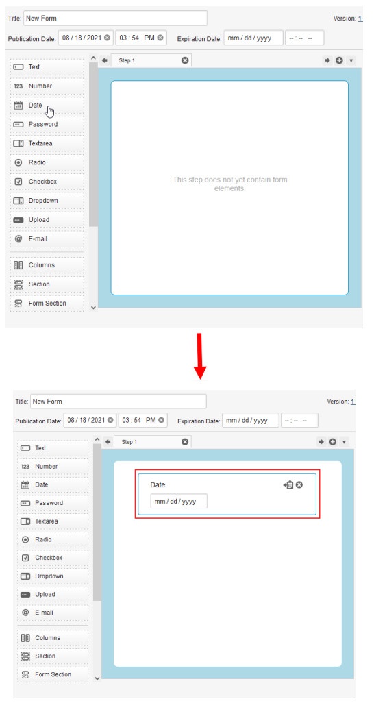
To add a form element using drag and drop, click the form element with the left mouse button and keep the left mouse button depressed, drag the form element with help of the "Helper" block onto the "Step" pane and onto the dotted rectangle and then release the left mouse button to drop the form element onto the step.
When a form element is added to a step, the basic properties for the form element can be defined. For example, when you click on a Date form element in a step, its properties appear in the "Properties" section. By default, XperienCentral gives each form element the title "<step name> <Input x>" where x increases by a value of 1 each time a new form element is added. In almost all cases you should change the title of a form element to something meaningful if the titles are shown in the form on the frontend. Because of this default naming scheme, you may sometimes see that a new step added using drag and drop does not seem to have a logical digit. For example, if you add an eighth step between steps 3 and 4 using drag-and-drop, it is named "step 8" — this is nevertheless correct because it was the eighth step added to the form.
To show all properties for a form element, click the expand icon. The full set of properties then appears. Each of the standard form elements is described in the following sections. The frontend examples of how the form elements will look to website visitors will not appear exactly as shown because the presentation you will see is based on your corporate style.
Text Form Element
The Text form element is a field in a form where text can be entered. Use this element to allow website visitors to enter text, for example a first or last name, city, and so forth. A mix of numbers and letters are acceptable in a Text form element. The Text form element contains the following properties:
| Property | Description |
|---|---|
| Title | The text that appears next to the text input field in the step pane and in the form on the frontend. |
| Required field | Specifies whether the field is required. |
| Show title | Specifies whether to show the title of the form element in the step pane and in the form on the frontend. |
| Design template | Specifies the design template to use to render the form element on the frontend. This property will only be available if there are two or more design template for the form element. |
| Identifier | The unique identifier to use for this form element. The unique identifier is used in expressions for (pre)filling and (pre)conditions. Click here for information about renaming an identifier. GX Software strongly recommends that all form fragment identifiers be unique. |
| Precondition | The precondition decides in what situations the form element will be visible to the website visitor. |
| Help text | In this field you can enter text that displays next to the form element in the form in order to provide useful information on what input is requested/expected. How/whether this text appears in the form is controlled by your presentation. |
| Extra text | This is extra text that you can show by a form element to provide extra guidance regarding what the expected input is. How/whether this text appears in the form is controlled by your design template. |
| Prefilling | Prefilling determines the initial value of this form element for the website visitor. Prefilling is further described in the section Prefilling a Form Element. |
| Validations | Select one or more validator(s) to evaluate the input received by a form element in order to ensure that it conforms to the constraints you indicate. See the section Form Element Validations for complete information on using the validators. |
| CSS classname | Specifies the CSS class to use for rendering the form element. This option allows you to alter the how selected form elements appear in the form without globally altering the presentation. |
| Fragment Tag | A unique tag to identify the form fragment. This tag is rendered in the form fragment presentation as a custom data attribute of the form fragment itself. The attribute name is data-fragment-tag. When filling out this property for a form fragment, the attribute is added to the presentation and can be used by external applications like GX Software's BlueConic. |
| Maximum length | Specifies the maximum number of characters that will be accepted for the Text, Password, Textarea, and Email form elements. |
| Width | Specifies the width of the input box for the Text, Number, Password, Textarea, and Email form elements. What the value represents (pixels, characters, etc.) is determined by your presentation. |
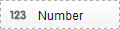
Number Form Element
The Number form element is a field in a form where numbers can be entered. As its name suggests, only integers are valid in this field. A decimal point is accepted but commas are not. If a website visitor enters text in a number field, an error message will appear indicating that the field contains invalid input. The Number form element contains the following properties:
| Property | Description |
|---|---|
| Title | The text that appears next to the number input field in the step pane and in the form on the frontend. |
| Required field | Specifies whether the field is required. |
| Show title | Specifies whether to show the title of the form element in the step pane and in the form on the frontend. |
| Design template | Specifies the design template to use to render the form element on the frontend. This property will only be available if there are two or more design template for the form element. |
| Identifier | The unique identifier to use for this form element. The unique identifier is used in expressions for (pre)filling and (pre)conditions. Click here for information about renaming an identifier. GX Software strongly recommends that all form fragment identifiers be unique. |
| Precondition | The precondition decides in what situations the form element will be visible to the website visitor. |
| Help text | In this field you can enter text that displays next to the form element in the form in order to provide useful information on what input is requested/expected. How/whether this text appears in the form is controlled by your presentation. |
| Extra text | This is extra text that you can show by a form element to provide extra guidance regarding what the expected input is. How/whether this text appears in the form is controlled by your design template. |
| Prefilling | Prefilling determines the initial value of this form element for the website visitor. Prefilling is further described in the section Prefilling a Form Element. |
| Validations | Select one or more validator(s) to evaluate the input received by a form element in order to ensure that it conforms to the constraints you indicate. See the section Form Element Validations for complete information on using the validators. |
| CSS classname | Specifies the CSS class to use for rendering the form element. This option allows you to alter the how selected form elements appear in the form without globally altering the presentation. |
| Fragment Tag | A unique tag to identify the form fragment. This tag is rendered in the form fragment presentation as a custom data attribute of the form fragment itself. The attribute name is data-fragment-tag. When filling out this property for a form fragment, the attribute is added to the presentation and can be used by external applications like GX Software's BlueConic. |
| Width | Specifies the width of the input box for the Text, Number, Password, Textarea, and Email form elements. What the value represents (pixels, characters, etc.) is determined by your presentation. |
| Minimum value | Specifies the smallest value that is acceptable as input for the Number form element. |
| Maximum value | Specifies the largest value that is acceptable as input for the Number form element. |

Date Form Element
The Date form element allows a website visitor to select a date from a date picker. The Date form element contains the following properties:
| Property | Description |
|---|---|
| Title | The text that appears next to the date field in the step pane and in the form on the frontend. |
| Required field | Specifies whether the field is required. |
| Show title | Specifies whether to show the title of the form element in the step pane and in the form on the frontend. |
| Design template | Specifies the design template to use to render the form element on the frontend. This property will only be available if there are two or more design template for the form element. |
| Identifier | The unique identifier to use for this form element. The unique identifier is used in expressions for (pre)filling and (pre)conditions. Click here for information about renaming an identifier. GX Software strongly recommends that all form fragment identifiers be unique. |
| Precondition | The precondition decides in what situations the form element will be visible to the website visitor. |
| Help text | In this field you can enter text that displays next to the form element in the form in order to provide useful information on what input is requested/expected. How/whether this text appears in the form is controlled by your presentation. |
| Extra text | This is extra text that you can show by a form element to provide extra guidance regarding what the expected input is. How/whether this text appears in the form is controlled by your design template. |
| Prefilling | Prefilling determines the initial value of this form element for the website visitor. For the Date element, a prefilled date must be of the form yyyy-MM-dd (2021-07-15 for example). Prefilling is further described in the section Prefilling a Form Element. |
| Validations | Select one or more validator(s) to evaluate the input received by a form element in order to ensure that it conforms to the constraints you indicate. See the section Form Element Validations for complete information on using the validators. |
| CSS classname | Specifies the CSS class to use for rendering the form element. This option allows you to alter the how selected form elements appear in the form without globally altering the presentation. |
| Fragment Tag | A unique tag to identify the form fragment. This tag is rendered in the form fragment presentation as a custom data attribute of the form fragment itself. The attribute name is data-fragment-tag. When filling out this property for a form fragment, the attribute is added to the presentation and can be used by external applications like GX Software's BlueConic. |
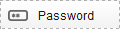
Password Form Element
The Password form element allows website visitors to enter a password. The entry is masked for privacy. The Password form element contains the following properties:
| Property | Description |
|---|---|
| Title | The text that appears next to the password input field in the step pane and in the form on the frontend. |
| Required field | Specifies whether the field is required. |
| Show title | Specifies whether to show the title of the form element in the step pane and in the form on the frontend. |
| Design template | Specifies the design template to use to render the form element on the frontend. This property will only be available if there are two or more design template for the form element. |
| Identifier | The unique identifier to use for this form element. The unique identifier is used in expressions for (pre)filling and (pre)conditions. Click here for information about renaming an identifier. GX Software strongly recommends that all form fragment identifiers be unique. |
| Precondition | The precondition decides in what situations the form element will be visible to the website visitor. |
| Help text | In this field you can enter text that displays next to the form element in the form in order to provide useful information on what input is requested/expected. How/whether this text appears in the form is controlled by your presentation. |
| Extra text | This is extra text that you can show by a form element to provide extra guidance regarding what the expected input is. How/whether this text appears in the form is controlled by your design template. |
| Prefilling | Prefilling determines the initial value of this form element for the website visitor. Prefilling is further described in the section Prefilling a Form Element. |
| Validations | Select one or more validator(s) to evaluate the input received by a form element in order to ensure that it conforms to the constraints you indicate. See the section Form Element Validations for complete information on using the validators. |
| CSS classname | Specifies the CSS class to use for rendering the form element. This option allows you to alter the how selected form elements appear in the form without globally altering the presentation. |
| Fragment Tag | A unique tag to identify the form fragment. This tag is rendered in the form fragment presentation as a custom data attribute of the form fragment itself. The attribute name is data-fragment-tag. When filling out this property for a form fragment, the attribute is added to the presentation and can be used by external applications like GX Software's BlueConic. |
| Maximum length | Specifies the maximum number of characters that will be accepted for the Text, Password, Textarea, and Email form elements. |
| Width | Specifies the width of the input box for the Text, Number, Password, Textarea, and Email form elements. What the value represents (pixels, characters, etc.) is determined by your presentation. |
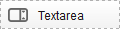
Text Area Form Element
The Textarea form element allows website visitors to enter multiple lines/paragraphs of text. The Textarea form element contains the following basic properties:
| Property | Description |
|---|---|
| Title | The text that appears next to the password input field in the step pane and in the form on the frontend. |
| Required field | Specifies whether the field is required. |
| Show title | Specifies whether to show the title of the form element in the step pane and in the form on the frontend. |
| Design template | Specifies the design template to use to render the form element on the frontend. This property will only be available if there are two or more design template for the form element. |
| Identifier | The unique identifier to use for this form element. The unique identifier is used in expressions for (pre)filling and (pre)conditions. Click here for information about renaming an identifier. GX Software strongly recommends that all form fragment identifiers be unique. |
| Precondition | The precondition decides in what situations the form element will be visible to the website visitor. |
| Help text | In this field you can enter text that displays next to the form element in the form in order to provide useful information on what input is requested/expected. How/whether this text appears in the form is controlled by your presentation. |
| Extra text | This is extra text that you can show by a form element to provide extra guidance regarding what the expected input is. How/whether this text appears in the form is controlled by your design template. |
| Prefilling | Prefilling determines the initial value of this form element for the website visitor. Prefilling is further described in the section Prefilling a Form Element. |
| Validations | Select one or more validator(s) to evaluate the input received by a form element in order to ensure that it conforms to the constraints you indicate. See the section Form Element Validations for complete information on using the validators. |
| CSS classname | Specifies the CSS class to use for rendering the form element. This option allows you to alter the how selected form elements appear in the form without globally altering the presentation. |
| Fragment Tag | A unique tag to identify the form fragment. This tag is rendered in the form fragment presentation as a custom data attribute of the form fragment itself. The attribute name is data-fragment-tag. When filling out this property for a form fragment, the attribute is added to the presentation and can be used by external applications like GX Software's BlueConic. |
| Maximum length | Specifies the maximum number of characters that will be accepted for the Text, Password, Textarea, and Email form elements. |
| Width | Specifies the width of the input box for the Text, Number, Password, Textarea, and Email form elements. What the value represents (pixels, characters, etc.) is determined by your presentation. |
| Height | Specifies the height of the input box for the Textarea element. What the value represents (pixels, characters, etc.) is determined by your presentation. |
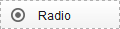
Radio Form Element
The Radio form element allows the website visitor to choose an item from a list by selecting the radio button next to their choice — With this form element only one item can be selected. The radio form element contains the following properties
| Property | Description |
|---|---|
| Title | The text that appears next to the password input field in the step pane and in the form on the frontend. |
| Required field | Specifies whether the field is required. |
| Identifiers | Special identifiers that can be saved to the form session and in form logic (JavaScript). See Scripting in Forms for complete information on using identifiers. |
| Choice 1 | The text that will appear next to the first radio button choice. |
| Choice 2 | The text that will appear next to the second radio button choice. |
| Add item | Allows you to add additional items to the list presented to the website visitor. |
| Show title | Specifies whether to show the title of the form element in the step pane and in the form on the frontend. |
| Design template | Specifies the design template to use to render the form element on the frontend. This property will only be available if there are two or more design template for the form element. |
| Identifier | The unique identifier to use for this form element. The unique identifier is used in expressions for (pre)filling and (pre)conditions. Click here for information about renaming an identifier. GX Software strongly recommends that all form fragment identifiers be unique. |
| Precondition | The precondition decides in what situations the form element will be visible to the website visitor. |
| Help text | In this field you can enter text that displays next to the form element in the form in order to provide useful information on what input is requested/expected. How/whether this text appears in the form is controlled by your presentation. |
| Extra text | This is extra text that you can show by a form element to provide extra guidance regarding what the expected input is. How/whether this text appears in the form is controlled by your design template. |
| Prefilling | Prefilling determines the initial value of this form element for the website visitor. Prefilling is further described in the section Prefilling a Form Element. |
| Validations | Select one or more validator(s) to evaluate the input received by a form element in order to ensure that it conforms to the constraints you indicate. See the section Form Element Validations for complete information on using the validators. |
| CSS classname | Specifies the CSS class to use for rendering the form element. This option allows you to alter the how selected form elements appear in the form without globally altering the presentation. |
| Fragment Tag | A unique tag to identify the form fragment. This tag is rendered in the form fragment presentation as a custom data attribute of the form fragment itself. The attribute name is data-fragment-tag. When filling out this property for a form fragment, the attribute is added to the presentation and can be used by external applications like GX Software's BlueConic. |
Checkbox Form Element
The Checkbox form element allows the website visitor to select one or more items from a list. The Checkbox form element contains the following properties:
| Property | Description |
|---|---|
| Title | The text that appears next to the password input field in the step pane and in the form on the frontend. |
| Required field | Specifies whether the field is required. |
| Identifiers | Special identifiers that can be saved to the form session and in form logic (JavaScript). See Scripting in Forms for complete information on using identifiers. |
| Option 1 | The text that will appear next to the first checkbox choice. |
| Option 2 | The text that will appear next to the checkbox radio button choice. |
| Add item | Allows you to add additional items to the list presented to the website visitor. |
| Show title | Specifies whether to show the title of the form element in the step pane and in the form on the frontend. |
| Design template | Specifies the design template to use to render the form element on the frontend. This property will only be available if there are two or more design template for the form element. |
| Identifier | The unique identifier to use for this form element. The unique identifier is used in expressions for (pre)filling and (pre)conditions. Click here for information about renaming an identifier. GX Software strongly recommends that all form fragment identifiers be unique. |
| Precondition | The precondition decides in what situations the form element will be visible to the website visitor. |
| Help text | In this field you can enter text that displays next to the form element in the form in order to provide useful information on what input is requested/expected. How/whether this text appears in the form is controlled by your presentation. |
| Extra text | This is extra text that you can show by a form element to provide extra guidance regarding what the expected input is. How/whether this text appears in the form is controlled by your design template. |
| Prefilling | Prefilling determines the initial value of this form element for the website visitor. Prefilling is further described in the section Prefilling a Form Element. |
| Validations | Select one or more validator(s) to evaluate the input received by a form element in order to ensure that it conforms to the constraints you indicate. See the section Form Element Validations for complete information on using the validators. |
| CSS classname | Specifies the CSS class to use for rendering the form element. This option allows you to alter the how selected form elements appear in the form without globally altering the presentation. |
| Fragment Tag | A unique tag to identify the form fragment. This tag is rendered in the form fragment presentation as a custom data attribute of the form fragment itself. The attribute name is data-fragment-tag. When filling out this property for a form fragment, the attribute is added to the presentation and can be used by external applications like GX Software's BlueConic. |
Drop-down Form Element
The Drop-down form element allows the website visitor to select an item from a drop-down list. The Drop-down form element contains the following basic properties:
| Property | Description |
|---|---|
| Title | The text that appears next to the password input field in the step pane and in the form on the frontend. |
| Required field | Specifies whether the field is required. |
| Identifiers | Special identifiers that can be saved to the form session and in form logic (JavaScript). See Scripting in Forms for complete information on using identifiers. |
| Choice 1 | The text that will appear next to the first checkbox choice. |
| Choice 2 | The text that will appear next to the checkbox radio button choice. |
| Add item | Allows you to add additional items to the list presented to the website visitor. |
| Show title | Specifies whether to show the title of the form element in the step pane and in the form on the frontend. |
| Design template | Specifies the design template to use to render the form element on the frontend. This property will only be available if there are two or more design template for the form element. |
| Identifier | The unique identifier to use for this form element. The unique identifier is used in expressions for (pre)filling and (pre)conditions. Click here for information about renaming an identifier. GX Software strongly recommends that all form fragment identifiers be unique. |
| Precondition | The precondition decides in what situations the form element will be visible to the website visitor. |
| Help text | In this field you can enter text that displays next to the form element in the form in order to provide useful information on what input is requested/expected. How/whether this text appears in the form is controlled by your presentation. |
| Extra text | This is extra text that you can show by a form element to provide extra guidance regarding what the expected input is. How/whether this text appears in the form is controlled by your design template. |
| Prefilling | Prefilling determines the initial value of this form element for the website visitor. Prefilling is further described in the section Prefilling a Form Element. |
| Validations | Select one or more validator(s) to evaluate the input received by a form element in order to ensure that it conforms to the constraints you indicate. See the section Form Element Validations for complete information on using the validators. |
| CSS classname | Specifies the CSS class to use for rendering the form element. This option allows you to alter the how selected form elements appear in the form without globally altering the presentation. |
| Fragment Tag | A unique tag to identify the form fragment. This tag is rendered in the form fragment presentation as a custom data attribute of the form fragment itself. The attribute name is data-fragment-tag. When filling out this property for a form fragment, the attribute is added to the presentation and can be used by external applications like GX Software's BlueConic. |
Upload Form Element
The Upload form element allows a website visitor to upload a file from their local computer or network to your website. The Upload form element contains the following properties:
| Property | Description |
|---|---|
| Title | The text that appears next to the password input field in the step pane and in the form on the frontend. |
| Required field | Specifies whether the field is required. |
| Show title | Specifies whether to show the title of the form element in the step pane and in the form on the frontend. |
| Presentation | Specifies the design template to use to render the form element on the frontend. This property will only be available if there are two or more design template for the form element. |
| Identifier | The unique identifier to use for this form element. The unique identifier is used in expressions for (pre)filling and (pre)conditions. Click here for information about renaming an identifier. GX Software strongly recommends that all form fragment identifiers be unique. |
| Precondition | The precondition decides in what situations the form element will be visible to the website visitor. |
| Help Text | In this field you can enter text that displays next to the form element in the form in order to provide useful information on what input is requested/expected. How/whether this text appears in the form is controlled by your presentation. |
| Extra Text | This is extra text that you can show by a form element to provide extra guidance regarding what the expected input is. How/whether this text appears in the form is controlled by your design template. |
| Prefilling | Prefilling determines the initial value of this form element for the website visitor. Prefilling is further described in the section and Prefilling a Form Element. |
| Validations | Select one or more validator(s) to evaluate the input received by a form element in order to ensure that it conforms to the constraints you indicate. See the section Form Element Validations for complete information on using the validators. |
| CSS classname | Specifies the CSS class to use for rendering the form element. This option allows you to alter the how selected form elements appear in the form without globally altering the presentation. |
| Fragment Tag | A unique tag to identify the form fragment. This tag is rendered in the form fragment presentation as a custom data attribute of the form fragment itself. The attribute name is data-fragment-tag. When filling out this property for a form fragment, the attribute is added to the presentation and can be used by external applications like GX Software's BlueConic. |
| Accepted extensions | Specifies the file extensions that are accepted. This allows you to enforce and/or restrict which file types can be uploaded in an interactive form. |
| Accepted MIME types | Specifies the MIME types that are accepted. This allows you to enforce and/or restrict which MIME types can be uploaded in an interactive form. |
| Minimum number of uploads | This setting was introduced in XperienCentral version R33. Specifies the minimum number of uploads the form element may contain. The default is 1. |
| Maximum number of uploads | This setting was introduced in XperienCentral version R33. Specifies the maximum number of files this form element may upload simultaneously. The default is 1. When the value is higher than one, a website visitor can upload between 1 and the maximum number of allowed files simultaneously in an Upload form element. |
Application Managers
- The directories where uploads may be stored must first be configured in the General tab of the Setup Tool. By default, no valid file upload directories are configured. See file_upload_valid_directories for more information.
- By default, the Upload File element has the Check File Type and Check File Extension validations assigned to it. These cannot be removed and for security reasons, GX strongly recommends that you fill in the valid fields for these validations.

E-mail Form Element
The E-mail form element allows a website visitor to enter their e-mail address. The E-mail form element contains the following properties:
| Property | Description |
|---|---|
| Title | The text that appears next to the password input field in the step pane and in the form on the frontend. |
| Required field | Specifies whether the field is required. |
| Show title | Specifies whether to show the title of the form element in the step pane and in the form on the frontend. |
| Design template | Specifies the design template to use to render the form element on the frontend. This property will only be available if there are two or more design template for the form element. |
| Identifier | The unique identifier to use for this form element. The unique identifier is used in expressions for (pre)filling and (pre)conditions. Click here for information about renaming an identifier. GX Software strongly recommends that all form fragment identifiers be unique. |
| Precondition | The precondition decides in what situations the form element will be visible to the website visitor. |
| Help text | In this field you can enter text that displays next to the form element in the form in order to provide useful information on what input is requested/expected. How/whether this text appears in the form is controlled by your presentation. |
| Extra text | This is extra text that you can show by a form element to provide extra guidance regarding what the expected input is. How/whether this text appears in the form is controlled by your design template. |
| Prefilling | Prefilling determines the initial value of this form element for the website visitor. Prefilling is further described in the section Prefilling a Form Element. |
| Validations | Select one or more validator(s) to evaluate the input received by a form element in order to ensure that it conforms to the constraints you indicate. See the section Form Element Validations for complete information on using the validators. |
| CSS classname | Specifies the CSS class to use for rendering the form element. This option allows you to alter the how selected form elements appear in the form without globally altering the presentation. |
| Fragment Tag | A unique tag to identify the form fragment. This tag is rendered in the form fragment presentation as a custom data attribute of the form fragment itself. The attribute name is data-fragment-tag. When filling out this property for a form fragment, the attribute is added to the presentation and can be used by external applications like GX Software's BlueConic. |
| Maximum Length | Specifies the maximum number of characters that will be accepted for the Text, Password, Textarea, and Email form elements. |
| Width | Specifies the width of the input box for the Text, Number, Password, Textarea, and Email form elements. What the value represents (pixels, characters, etc.) is determined by your presentation. |
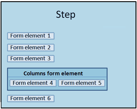
Columns Form Element
By default, form elements appear in a step stacked one on top of the other, from top to bottom. The Columns form element allows you to place (and display) form elements side by side:
The Column form element has the following properties:
| Property | Description |
|---|---|
| Title | The text that appears next to the password input field in the step pane and in the form on the frontend. |
| Required field | Specifies whether the field is required. |
| Show title | Specifies whether to show the title of the form element in the step pane and in the form on the frontend. |
| Design template | Specifies the design template to use to render the form element on the frontend. This property will only be available if there are two or more design template for the form element. |
| Identifier | The unique identifier to use for this form element. The unique identifier is used in expressions for (pre)filling and (pre)conditions. Click here for information about renaming an identifier. GX Software strongly recommends that all form fragment identifiers be unique. |
| Precondition | The precondition decides in what situations the form element will be visible to the website visitor. |
| CSS classname | Specifies the CSS class to use for rendering the form element. This option allows you to alter the how selected form elements appear in the form without globally altering the presentation. |
| Fragment Tag | A unique tag to identify the form fragment. This tag is rendered in the form fragment presentation as a custom data attribute of the form fragment itself. The attribute name is data-fragment-tag. When filling out this property for a form fragment, the attribute is added to the presentation and can be used by external applications like GX Software's BlueConic. |
To add form elements to a column, you must first add the elements to the form and the use drag and drop to place them in the Columns form element.
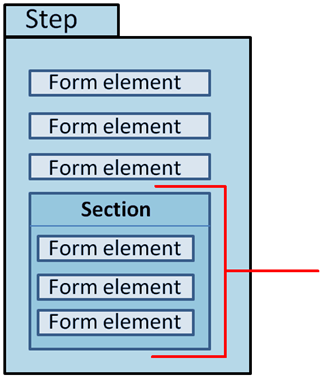
Section Form Element
The Section form element is a container into which you can place two or more elements. This makes it possible to create groupings of form elements that you can easily move from one part of a step to another in one action. The idea is similar to a Form Section except that it cannot be reused in more than one step or form.
The Section form element contains the following properties:
| Property | Description |
|---|---|
| Title | The text that appears next to the password input field in the step pane and in the form on the frontend. |
Show title | Specifies whether to show the title of the form element in the step pane and in the form on the frontend. |
| Identifier | The unique identifier to use for this form element. The unique identifier is used in expressions for (pre)filling and (pre)conditions. Click here for information about renaming an identifier. GX Software strongly recommends that all form fragment identifiers be unique. |
| Precondition | The precondition decides in what situations the form element will be visible to the website visitor. |
| CSS classname | Specifies the CSS class to use for rendering the form element. This option allows you to alter the how selected form elements appear in the form without globally altering the presentation. |
| Fragment Tag | A unique tag to identify the form fragment. This tag is rendered in the form fragment presentation as a custom data attribute of the form fragment itself. The attribute name is data-fragment-tag. When filling out this property for a form fragment, the attribute is added to the presentation and can be used by external applications like GX Software's BlueConic. |
Form Section Element
Use the Form Section element to insert a form section into a form. A form section is a sub-form that you can reuse in multiple forms. This is especially useful when you have several forms that differ slightly from each other but still contain an identical group of form elements. Creating and managing form sections is described in the section Form Sections. The Section form element contains the following properties:
| Property | Description |
|---|---|
| Title | The text that appears next to the password input field in the step pane and in the form on the frontend. |
| Show title | Specifies whether to show the title of the form element in the step pane and in the form on the frontend. |
| Design template | Specifies the design template to use to render the form element on the frontend. This property will only be available if there are two or more design template for the form element. |
| Identifier | The unique identifier to use for this form element. The unique identifier is used in expressions for (pre)filling and (pre)conditions. Click here for information about renaming an identifier. GX Software strongly recommends that all form fragment identifiers be unique. |
| Precondition | The precondition decides in what situations the form element will be visible to the website visitor. |
| CSS classname | Specifies the CSS class to use for rendering the form element. This option allows you to alter the how selected form elements appear in the form without globally altering the presentation. |
| Fragment Tag | A unique tag to identify the form fragment. This tag is rendered in the form fragment presentation as a custom data attribute of the form fragment itself. The attribute name is data-fragment-tag. When filling out this property for a form element, the attribute is added to the presentation and can be used by external applications like GX Software's BlueConic. |

Repeat Form Element
The Repeat form element repeats a form section the number of times selected by a website visitor. This is useful for a form that requests repeated information. The Repeat form element contains the following properties:
| Property | Description |
|---|---|
| Title | The text that appears next to the password input field in the step pane and in the form on the frontend. |
| Select Form Section | A drop-down list from which you can select the repeating form section. |
| Show title | Specifies whether to show the title of the form element in the step pane and in the form on the frontend. |
| Design template | Specifies the design template to use to render the form element on the frontend. This property will only be available if there are two or more design template for the form element. |
| Identifier | The unique identifier to use for this form element. The unique identifier is used in expressions for (pre)filling and (pre)conditions. Click here for information about renaming an identifier. GX Software strongly recommends that all form fragment identifiers be unique. |
| Precondition | The precondition decides in what situations the form element will be visible to the website visitor. |
| CSS classname | Specifies the CSS class to use for rendering the form element. This option allows you to alter the how selected form elements appear in the form without globally altering the presentation. |
| Fragment Tag | A unique tag to identify the form fragment. This tag is rendered in the form fragment presentation as a custom data attribute of the form fragment itself. The attribute name is data-fragment-tag. When filling out this property for a form fragment, the attribute is added to the presentation and can be used by external applications like GX Software's BlueConic. |
| Maximum number of repeats | For the Repeat form element, specify the maximum number of times the specified form section can be repeated. |
| Prefix for repeat | The text that will be prefixed to each repeat. This text will be visible to the website visitor. |
Next Button Form Element
The Next Button form element navigates website visitors to the following step in a form. If the Next Button is on the final step in a form, it essentially functions as a "Finish" button.
By default the Next Button will navigate to the next Form Step as defined in the form. If the routing should be different, then this can be configured through "Handlers and Routers" (see Routers).
The Next Button form element contains the following properties:
| Property | Description |
|---|---|
| Title | The text that appears next to the password input field in the step pane and in the form on the frontend. |
| Show title | Specifies whether to show the title of the form element in the step pane and in the form on the frontend. |
| Design template | Specifies the design template to use to render the form element on the frontend. This property will only be available if there are two or more design template for the form element. |
| Identifier | The unique identifier to use for this form element. The unique identifier is used in expressions for (pre)filling and (pre)conditions. Click here for information about renaming an identifier. Important Due to a JQuery issue, do not use the identifier "submit" for the Next button. |
| Precondition | The precondition decides in what situations the form element will be visible to the website visitor. |
| CSS classname | Specifies the CSS class to use for rendering the form element. This option allows you to alter the how selected form elements appear in the form without globally altering the presentation. |
| Fragment Tag | A unique tag to identify the form fragment. This tag is rendered in the form fragment presentation as a custom data attribute of the form fragment itself. The attribute name is data-fragment-tag. When filling out this property for a form fragment, the attribute is added to the presentation and can be used by external applications like GX Software's BlueConic. |
Back Button Form Element
The Back Button form element navigates a website visitor to the step he was on before he entered the current step.
If the last step in the form has the purpose of thanking the visitor for completing the form, then do not place a "Back" button on this last step. For each visitor, Interactive Forms keeps track of the visited steps, but will clean up this information when showing the last step of a form. If the visitor clicks a "Back" button on the last step, then he will be routed back to step 1 because at that point the history of visited steps is not available anymore.
The "Back" button form element contains the following properties:
| Property | Description |
|---|---|
| Title | The text that appears next to the password input field in the step pane and in the form on the frontend. |
| Show title | Specifies whether to show the title of the form element in the step pane and in the form on the frontend. |
| Design template | Specifies the design template to use to render the form element on the frontend. This property will only be available if there are two or more design template for the form element. |
| Identifier | The unique identifier to use for this form element. The unique identifier is used in expressions for (pre)filling and (pre)conditions. Click here for information about renaming an identifier. GX Software strongly recommends that all form element identifiers be unique. |
| Precondition | The precondition decides in what situations the form element will be visible to the website visitor. |
| CSS classname | Specifies the CSS class to use for rendering the form element. This option allows you to alter the how selected form elements appear in the form without globally altering the presentation. |
| Fragment Tag | A unique tag to identify the form fragment. This tag is rendered in the form fragment presentation as a custom data attribute of the form fragment itself. The attribute name is data-fragment-tag. When filling out this property for a form fragment, the attribute is added to the presentation and can be used by external applications like GX Software's BlueConic. |
Paragraph Form Element
The Paragraph form element allows you to enter text in a form step. The text you enter can be instructional or provide other types of information regarding the interactive form the website visitor is filling in. The Paragraph form element contains the following properties:
| Property | Description |
|---|---|
| Title | The text that appears next to the text input field in the step pane and in the form on the frontend. |
| Required field | Specifies whether the field is required. |
| Show title | Specifies whether to show the title of the form element in the step pane and in the form on the frontend. |
| Design template | Specifies the design template to use to render the form element on the frontend. This property will only be available if there are two or more design template for the form element. |
| Identifier | The unique identifier to use for this form element. The unique identifier is used in expressions for (pre)filling and (pre)conditions. Click here for information about renaming an identifier. GX Software strongly recommends that all form fragment identifiers be unique. |
| Precondition | The precondition decides in what situations the form element will be visible to the website visitor. |
| Help text | In this field you can enter text that displays next to the form element in the form in order to provide useful information on what input is requested/expected. How/whether this text appears in the form is controlled by your presentation. |
| Extra text | This is extra text that you can show by a form element to provide extra guidance regarding what the expected input is. How/whether this text appears in the form is controlled by your design template. |
| Prefilling | Prefilling determines the initial value of this form element for the website visitor. Prefilling is further described in the section Prefilling a Form Element. |
| Validations | Select one or more validator(s) to evaluate the input received by a form element in order to ensure that it conforms to the constraints you indicate. See the section Form Element Validations for complete information on using the validators. |
| CSS classname | Specifies the CSS class to use for rendering the form element. This option allows you to alter the how selected form elements appear in the form without globally altering the presentation. |
| Fragment Tag | A unique tag to identify the form fragment. This tag is rendered in the form fragment presentation as a custom data attribute of the form fragment itself. The attribute name is data-fragment-tag. When filling out this property for a form fragment, the attribute is added to the presentation and can be used by external applications like GX Software's BlueConic. |
Overview Form Element
The Overview form element summarizes in a table the form elements that appear in a step and the names of the subsequent steps. The Overview form element contains the following properties:
| Property | Description |
|---|---|
| Title | The text that appears next to the password input field in the step pane and in the form on the frontend. |
| Show title | Specifies whether to show the title of the form element in the step pane and in the form on the frontend. |
| Design template | Specifies the design template to use to render the form element on the frontend. This property will only be available if there are two or more design template for the form element. |
| Identifier | The unique identifier to use for this form element. The unique identifier is used in expressions for (pre)filling and (pre)conditions. Click here for information about renaming an identifier. GX Software strongly recommends that all form fragment identifiers be unique. |
| Precondition | The precondition decides in what situations the form element will be visible to the website visitor. |
| CSS classname | Specifies the CSS class to use for rendering the form element. This option allows you to alter the how selected form elements appear in the form without globally altering the presentation. |
| Fragment Tag | A unique tag to identify the form fragment. This tag is rendered in the form fragment presentation as a custom data attribute of the form fragment itself. The attribute name is data-fragment-tag. When filling out this property for a form fragment, the attribute is added to the presentation and can be used by external applications like GX Software's BlueConic. |
Using the Interactive Forms Clipboard
You can copy one or more form elements to the Interactive Forms Clipboard and then paste them in the current form or in another form/form section. You can also copy handlers, routers and conditions. To use the Interactive Forms Clipboard, follow these steps:
- Hover the mouse over the "copy" icon in the upper right corner of a form element:
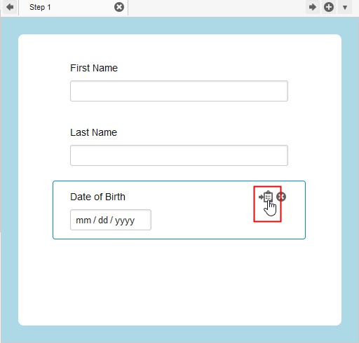
- Click the ‘Copy to Clipboard’ icon. A copy of the form element is now stored in the Clipboard and the Clipboard icon turns light blue to indicate it contains one or more items.
Pasting from the Interactive Forms Clipboard
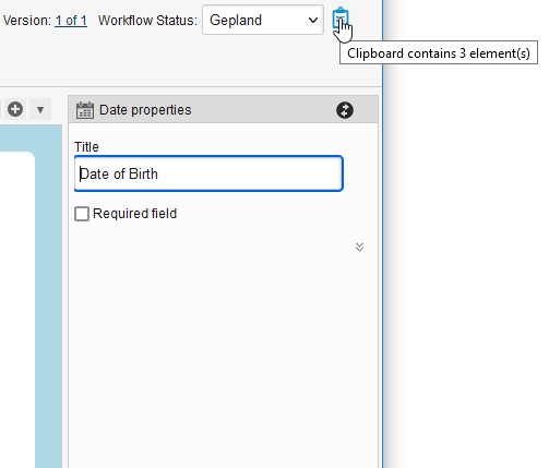
- To paste a form element, handler, router or condition from the Clipboard in a form step, click the Clipboard icon. Notice that as you hover the mouse over the Clipboard icon, a tool tip appears that informs you how many elements are currently on the Clipboard:
After you click the Clipboard icon, the contents of the Clipboard and the Clipboard menu display. For example: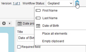
- Select the item that you want to paste in the form.
- To paste all items, select "Place all elements" from the menu.
- To empty the Clipboard, select "Empty clipboard" from the menu.