...
- Enter the Edit mode for the content item.
- Click [Insert] at the top of the Editor.
- Select "Anchor" if it is visible in the short list or click "More..." at the bottom of the Context menu to show all the content elements.
- From the "Add Anchor" drop-down list, select the element that you want to add and then click [Apply].
- Repeat the previous step for each element that you want to add.
- To add all elements from the content item to the Anchor, click [Add All Elements] and then click [Apply].
- In the list of elements that you have added, you can modify the title that appears in the Anchor. By default, the title that appears in the list is the title assigned to the element.
- To change the order of the links in the Anchor, select a different number from the drop-down to the left of an element.
- To display a link that links back to the Anchor at the bottom of each element, select "Display 'Back to top' Link".
- Click [Apply].
- Save the content item.
...
| Anchor | ||||
|---|---|---|---|---|
|

An Application content element links to an external application. When clicked on by a website visitor, a pop-up window appears in which the external application appears. The available external applications are usually added by a main editor. To add an Application element, follow these steps:
- Enter the Edit mode for the content item.
- Click [Insert] at the top of the Editor.
- Select "Application" if it is visible in the short list or click "More..." at the bottom of the Context menu to show all the content elements.
- Select the external application from the "Application" drop-down list.
- Select the Design Template to use for the External Application from the "Design Template" drop-down list.
- Click [Apply] and then [OK].
...
| Anchor | ||||
|---|---|---|---|---|
|
A Content Overview content element shows a list of items from the Content Repository. You can add any content item available on your entire website to the Content Overview. Unlike a Dynamic Content Overview, a Content Overview is static: The content items you add to it at the time you create it remain the same from then on unless you modify them at a later time.
...
- Enter the Edit mode for the content item.
- Click [Insert] at the top of the Editor.
- Select "Overview" if it is visible in the short list or click "More..." at the bottom of the Context menu to show all the content elements.
Define the following properties:
Property Description Design Template Select the Design Template to use for the Content Overview from the "Design Template" drop-down list. Title The title that appears above the Overview. Items Click [Search] to select a content item that you want to add to the Overview. You can perform a search based on the available criteria and then click the content item in the results list and then click [Select]. The content item is added to the Overview. Perform this step for each content item you want to add. To change the order of the items in the Overview, select a different number from the drop-down list that determines the order in which the items are displayed. Show content items on Select the page on which the Overview will be displayed. To use the "Other page" option, click [Search] to do a search for the page on which you want the Overview to be displayed. - Click [Apply] and then [OK].
...
| Anchor | ||||
|---|---|---|---|---|
|

A Discussion content element displays a discussion between you and your website visitors. Discussions can be moderated either before or after a post has been made. One or more "discussion models" are available to use for the discussion. The model defines who may post entries to the discussion, how it is moderated, and so forth. To add a Discussion element, follow these steps:
...
- Navigate to the [Moderate] tab.
- Select the discussion from the discussion list.
- Select the relevant thread.
- Click a message to view it and to change its state from 'New and non-public' to 'Public' or 'Rejected'. In this example, 'You're all stupid' has all the hallmarks of a message that is most likely inappropriate and needs to be rejected.
- Click a message to view it. An overview of the message will appear that lists the reactions that have been sent.
- Click the link for the message next to Thread to view the message. Since this message is not suitable for the forum, it is rejected. This message is now no longer visible in the thread. However, it still exists in XperienCentral and its state could be changed to 'Public' in the future.
...
| Anchor | ||||
|---|---|---|---|---|
|

A Download content element makes a file available for download by website visitors. To add a Download element, follow these steps:
...
| Note |
|---|
XperienCentral enforces a maximum file size for downloads, which is configurable. If you receive an error message when trying to add a file to a Download element, contact your application manager. |
...
| Anchor | ||||
|---|---|---|---|---|
|
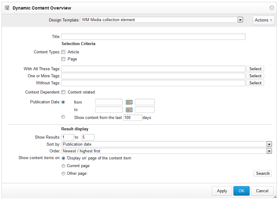
A Dynamic Content Overview element displays a list of items from the Content Repository. You can specify which items to show based on type, one or more tags, as well according to publication date or items that are a specified number of days old. The overview is dynamic, which means that over time what it shows changes as new items are added to the Content Repository that match the criteria or items disappear as a result of their publication date falling outside the specified range. A Dynamic Overview is an ideal way to display relevant content like articles.
...
- Enter the Edit mode for the content item.
- Click [Insert] at the top of the Editor.
- Select "Dynamic Content Overview" if it is visible in the short list or click "More..." at the bottom of the Context menu to show all the content elements.
Define the following properties:
Property Description Design Template Select the Design Template to use for the Dynamic Content Overview from the "Design Template" drop-down list. Title The title that appears above the Dynamic Overview. Content Types Select the content types to include in the Dynamic Overview. With All These Tags Limits the overview to all items that have two or more of the same tags. One or More Tags Limit the overview to all items that have any one of a list of multiple tags. Without Tags Limits the overview to all items that do not have one or more of the specified tags. Publication Date Limits the overview to all items that have a publication date that falls within the specified date range. Show content from the last x days Limits the overview to all items that are no more than the specified number of days old. - Click [Apply] and then [OK].
...
| Anchor | ||||
|---|---|---|---|---|
|
A Flash content element displays an Adobe Flash animation. To add a Flash element, follow these steps:
- Enter the Edit mode for the content item.
- Click [Insert] at the top of the Editor.
- Select "Flash" if it is visible in the short list or click "More..." at the bottom of the Context menu to show all the content elements.
Define the following properties:
Property Description Flash File The file containing the Adobe Flash animation. Width The width, in pixels, to use to display the Flash animation. If you do not enter a width, the width of the Flash itself is used. Height The height, in pixels, to use to display the Flash animation. If you do not enter a height, the height of the Flash itself is used. Parameters Add one or more parameters that will be displayed in a table along with the Flash animation, To add a parameter, select the parameter type from the "Parameters" drop-down list, enter the string for the parameter in the field and then click [Add]. Click [Apply] and then [OK].
...
| Anchor | ||||
|---|---|---|---|---|
|

An Image element displays a graphic. The supported formats are .GIF, BMP, JPG, PNG and SVG. You can select an image from a local disk or from the Content Repository. To add an Image element, follow these steps:
...
To remove a focus point from an image, click [Remove focus point].
...
| Anchor | ||||
|---|---|---|---|---|
|
An Interactive Form element adds a form to a content item which a website visitor can fill in and submit. The available interactive forms are usually created by a main editor. To add an Interactive Form element, follow these steps:
...
Layouts are custom templates that make it possible for you to render content in a wide variety of ways. Layouts can be added to content items via the Insert menu in the Editor. Contact your main editor or application manager for information about the layouts that are available.
Back to top
...
| Anchor | ||||
|---|---|---|---|---|
|

A List element adds a bulleted list to a content item. To add a List element, follow these steps:
- Enter the Edit mode for the content item.
- Click [Insert] at the top of the Editor.
- Select "List" if it is visible in the short list or click "More..." at the bottom of the Context menu to show all the content elements.
- Select the Design Template to use for the List Element from the "Design Template" drop-down list.
- Enter a title for the List element in the "Title" field.
- To make the bulleted list a hyperlink, select a link code from the "Link Code" drop-down list.
- Enter the text for the first item in the bulleted list in the "Items" field and then click [Add Item]. The item is added.
- Repeat the previous step for each item that you want to add.
- To change the order of the items in the list, select a different number from the drop-down list that determines the order in which the items are displayed.
- Click [Apply] and then [OK].
...
| Anchor | ||||
|---|---|---|---|---|
|
A Page Overview element displays a list of web pages and their sub pages. The title of the pages in the overview is a hyperlink that redirect the website visitor to that page when they click it. To add a Page Overview element, follow these steps:
- Enter the Edit mode for the content item.
- Click [Insert] at the top of the Editor.
- Select "Page Overview" if it is visible in the short list or click "More..." at the bottom of the Context menu to show all the content elements.
Define the following properties:
Property Description Design Template Select the Design Template to use for the Page Overview from the "Design Template" drop-down list. Title The title that appears above the Page Overview. Only Show Pages Below Specifies the page that comes first in the overview hierarchy. By default the top-most listed page is the home page. To select a different page click [Adjust]. Search for the new head page and then click [Select]. Only show newest Select this option to limit the pages shown to the newest x number of pages. Display newest pages Select this option to only show the newest pages in the range that you specify. For example, to show the newest 20 pages, you would enter "from 1 to 20". Filters Filters make it possible to limit the pages shown bases on custom defined filters. You have the following filter options: - Age filter — Limits the pages shown based on the age of the page. "All pages" shows all pages that are up to a maximum of x days old. "All, except pages" shows all pages except for those that are a maximum of x days old.
- Label filter — Limits the pages shown based on the page label you specify. Select the label belonging to the page(s) you want to limit the overview to from the drop-down list.
- Date filter — Limits the pages shown to those with a publication date that falls within the defined range. Select a start and end date.
- Click [Apply] and then [OK].
...
| Anchor | ||||
|---|---|---|---|---|
|

- Enter the Edit mode for the content item.
- Click [Insert] at the top of the Editor.
- Select "Paragraph" if it is visible in the short list or click "More..." at the bottom of the Context menu to show all the content elements.
- Enter a title for the Paragraph in the "Title" field.
- If you want the title of the Paragraph to be a hyperlink, select the link code for the hyperlink from the "Link Code" drop-down list.
- In the main text field, enter the text for the Paragraph. You can separate lines using hard returns.
- Click [Apply] and then [OK].
...
| Anchor | ||||
|---|---|---|---|---|
|

- Enter the Edit mode for the content item.
- Click [Insert] at the top of the Editor.
- Select "RSS Feed" if it is visible in the short list or click "More..." at the bottom of the Context menu to show all the content elements.
Define the following properties:
Property Description Title The title that appears above the RSS Feed. News Feed URL The URL of the RSS feed (http://rss.cnn.com/rss/edition.rss, for example). Show News Item Specify the news items from the RSS feed to show. For example, to show the first 20 items, enter "1 through 20". Update Frequency Specify how often, in seconds, the RSS feed is updated. - Click [Apply] and then [OK].
...
| Anchor | ||||
|---|---|---|---|---|
|

To add a Search element, follow these steps:
- Enter the Edit mode for the content item.
- Click [Insert] at the top of the Editor.
- Select "Search" if it is visible in the short list or click "More..." at the bottom of the Context menu to show all the content elements.
- Select the Design Template to use for the Search element from the "Design Template" drop-down list.
- Enter the size of the search box, in pixels in the "Search Box Size" field.
- Select the restriction(s), if any, that you want to impose on the visitor's search.
- Select where the search results will be displayed.
- Click [Apply] and then [OK].
...
| Anchor | ||||
|---|---|---|---|---|
|

- Enter the Edit mode for the content item.
- Click [Insert] at the top of the Editor.
- Select "Table" if it is visible in the short list or click "More..." at the bottom of the Context menu to show all the content elements.
Define the following properties:
Property Description Design Template Select the Design Template to use for the Table from the "Design Template" drop-down list. Title The title of the table. Link Code Assigns a link code to the table title. The website visitor will navigate to the URL specified by the link code if they click the title of the table. Width The width of the table. The value can be either in pixels or a percentage of the width of the content item. Headers Specifies whether to show a horizontal header, a vertical header or both. Position Specifies the position on the content item where the table will be displayed. The options are: - Centered — The table is centered on the content item (no wraparound).
- Left — The table is left justified. Other content elements or rich text, if present, wrap around the table.
- Right — The table is right justified. Other content elements or rich text, if present, wrap around the table.
- Clear — The table appears standalone between other content elements or rich text, if present.
Table Contents Add the rows and columns for the table and fill them with content. You can specify the width for each column individually. - Click [Apply] and then [OK].
...
| Anchor | ||||
|---|---|---|---|---|
|

A WYSIWYG content element displays content exactly as you format it. Entering text in a WYSIWYG element is performed using an editor within the Editor. You have all the same formatting options in the WYSIWYG editor as you do for entering rich text
Back to top
...
Resizing a Content Element Dialog Box
- Hover the mouse over the lower right-hand corner of the dialog box until the expand handle appears. For example:
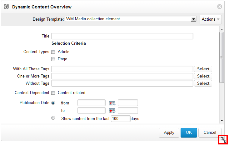
- Click and hold the left mouse button and then drag the mouse to expand the dialog box to the desired size. The following shows the Dynamic Content element fully expanded:
...
Selecting a Design Template
For some content elements, you can select the Design Template used to render it. The available templates are specific to your website. For complete information on which templates you should use for which content elements, contact your application manager.
Back to top
...