In This Topic
Opening a Form
In the Interactive Forms dialog, interactive forms appear in the left-most column. Forms can be arranged in categories in order to make it easier to find and manage them, especially when your project contains a wide variety and/or large number of forms.
To open a form for editing, click it in the list. For example:
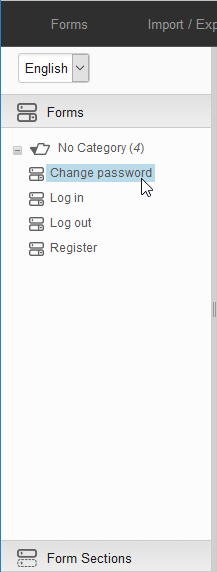
The form is opened in the right pane and is ready to be modified. As is the case with pages and page sections, only one user is allowed to have write access to an interactive form at the same time. To avoid conflicts between users, XperienCentral makes use of form locking. Whenever a user is busy modifying an interactive form or form section, all other users will see a visual indication that the form/form section is locked. When a form/form section is locked, its icon has a padlock attached to it. For example:
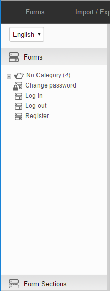
In the image above, the form "Change Password" is being modified by another and is locked. If you click a form/form section that is locked, you will see the following message:
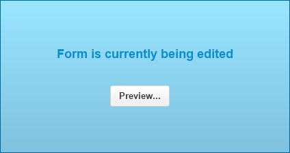
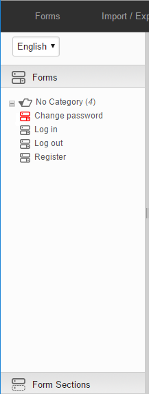
If you click [Preview], you can view the form/form section in read-only mode. If the icon for a form is red, that means that you do not have permission to edit that form due to the workflow assigned to your role. For example:
Managing Steps
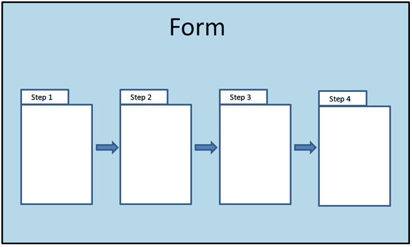
This section describes how to manage steps. For complete information on step properties (handlers, routers, etc.) see Form Step Properties. Steps in a form flow from the first to the last in the order they are arranged from left to right. For example:
Creating a New Step
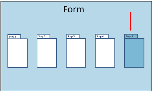
To create a new step, click the plus button (+) above the step pane. A new, empty step will be created. By default the name of the new step is "Step x" where x is one value higher than the current number of steps in the form. For example, if there are four steps, the name of the new step will be "Step 5". The new step is placed after the last step in the form in the far right position. For example.
Navigating Between Steps
To scroll between steps, click the left or right arrow above the step pane. Click on the tab of a step to set focus on that step. To select a step to navigate to from a list, click the step drop-down button above the step pane and select the step you want to jump to from the drop-down list.
Duplicating a Step
With Interactive Forms you can make a duplicate copy of a step. All form elements appear in the new step in the same order and with the same properties. Perform the following tasks to duplicate a step:
- Navigate to the step you want to duplicate in the step pane.
- Select Duplicate Step from the Forms menu. The step is duplicated. The name of the new step is "Duplicate of <step name>" and it is placed in the after the last step in the form in the far right position. For example:
Moving a Step
To move a step to a different part of the order, follow these steps:
- Click the step drop-down button above the step pane.
- In the drop-down list, click the step that you want to move with the left mouse button and keep the left mouse button depressed – Click on the name of the step.
- Drag the step to its new location.
- Release the left mouse button. Click the step drop-down button. The step is moved to its new location.
Deleting a Step
- To delete a step, click the "x" to the right of the step name.
- Click [OK] at the prompt to confirm the operation.
Managing a Form's State
As with content items, forms and form sections created with Interactive Forms have a specific workflow state that determines whether they can appear on the frontend of your website. A form and form section can have one of the following three states:
| State | Description |
|---|---|
| Active | The form is in a published state and will appear on the frontend of your website if placed in a Form element on a content item. Change the state of a form to "Active" in order to publish it. |
| Inactive | The form is not published or has been unpublished and cannot appear on the frontend of your website. Use this state for unpublished forms that are not in development. |
| Development | The form is currently under development and cannot appear on the frontend of your website. |
The state of a form can be visually determined by the text that is used to render it in the "Forms" tree. The name of a form in the "Active" state appears as normal text. The name of a form in the "Inactive" or "Development" state appear in italic text. To change a form's workflow state, follow these steps:
- Select the form from the "Forms" tree.
- From the drop-down list next to "State" above the "Properties" pane, select the new state for the form.
- Click [Apply] or press <Alt-S>.
Form Versions
You can create multiple versions of a form/form section, which makes it possible to modify a form or form section without it becoming unavailable or to be able to quickly switch between different versions. Only one version of a form/form section can be active at a time. To create a new version of a form/form section, follow these steps:
- Select the form/form section for which you want to create a new version from the "Forms" or "Form Sections" tree.
- Navigate to Forms > New Version. The new version is created and the currently active version of the version continues to display. Next to the "State" field above the "Properties" pane, the version indicator increases by one. The title of new form versions by default "<form name> (New Version)".
- To show a summary of all the versions of the current form/form section, click the "Version x of y" link above the "Properties" pane. You can also view all versions of the current form by selecting the menu item Forms > View Versions. A summary of all versions of the form/form section will appear.
The forms/form section version summary shows the following:
| Property | Description |
|---|---|
| Name | The title of the form/form section version. |
| Author | The name of the user who created the form version. |
| Publication Date | The date and time that the form version was or will be published. |
| Expiration Date | The date and time that the form version will expire. |
| Workflow Status | The workflow status of the form version. |
Form Version Details
To see more details about a form version, you can click it in the list. After clicking the form version, the following details will appear:
| Property | Description |
|---|---|
| Creation Date | The date and time that the form version was created. |
| Last Modified | The date and time that the form version was last modified. |
| Last Modified By | The name of the user who last modified the form version. |
| Import Date | If the form version was imported, this shows the date and time when that occurred. |
| Export Date | If the form version was exported, this shows the date and time when that occurred. |
| Import ID | The unique ID for the form version import. This is used to track the form version across its development stages. |
| Export ID | The unique ID for the form version export. This is used to track the form version across its development stages. |
Switching Versions of a Form/Form Section
To switch between versions of a form/form section, follow these steps:
- Select the form/form section from the "Forms" or "Form Sections" tree.
- Click the "Version x of y" link above the "Properties" pane.
- In the summary, click the name of the form version you want to switch to. The form/form section version you selected now displays.
- To make this version of the form the active version, select "Active" from the "State" drop-down list.
- Click [Apply]. In the form versions summary, the version you selected is now in the "Active" state and the previously active version of the form is automatically set to "Inactive" because only one version of a form can be active at a time.
Deleting a Form/Form Section Version
To delete a version of a form or form section, follow the steps below. To delete a form/form section and all its versions in one operation, see the section Deleting a Form.
- Select the form/form section from the "Forms" or "Form Sections" tree.
- Click the "Version x of y" link above the "Properties" pane.
Click the checkbox next to the version or versions of the form you want to delete.
You cannot select the currently active version of a form.
- Click [Delete]. The version is deleted.
- To select all versions (except the active one), click the checkbox next to "Name". This selects all versions except the currently active one.
- Click [Delete].
Language Versions
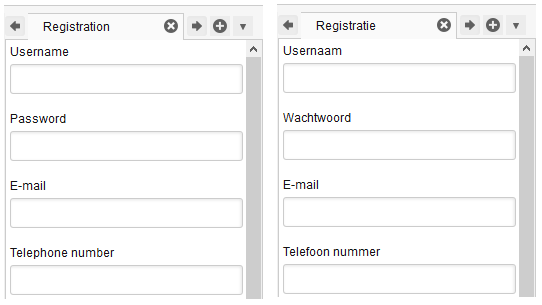
Just as with pages and page sections, you can maintain forms/form sections in more than one language. This makes it possible to quickly and easily create a form/form section and then present it in multiple languages. When you create a form, you must select a language for the form. For each of the supported languages, the form also exists, however, when you first switch to a different language version of a form, the form elements have blank labels as does the form itself. Unlike pages and page sections, different language versions of a form always have the exact same form element structure and content. The only difference between language versions of a form are the language labels that appear above each form element. For example:
All language versions of a form share the same state. It is not possible, for example, to assign the state of "Active" to one language version of a form and "Inactive" to another. There are two ways to manage the labels for language versions of a form: In the form itself and using Language Labels. Both methods are described below.
Managing Language Labels in a Form
You can manage a form's labels for each supported in the "Forms" interface. To manage the labels in the available languages, follow these steps:
- Select the language for which you want to manage the form element labels. The form as it appears in the language you select displays.
- Add a title in the target language.
- Add a title in the target language to each form element.
- Click [Apply]. Language labels and a title have been added to the target language version.
Managing Labels using Language Labels
Another method for managing form element labels for a language version is in the Language Labels dialog box. The advantage to this approach is that you can more quickly add/modify language labels for a form language version as well as for multiple versions of the form in the same language. In addition to the titles of the form elements, you can also quickly and easily manage the "Help Text" and "Extra Text".
To add/modify form element labels in the Language Labels dialog box, follow these steps:
- Navigate to Language Labels > Language Labels.
- From the "Language" drop-down list, select the language of the form you want to manage.
- From the "Form" drop-down list, select form whose labels you want to manage.
- Select the version of the form as well as the step containing the form elements whose labels you want to modify. The labels for the form appear. For each form element, the following is shown:
- The unique identifier for the form element
- The title of the form element
- The "Help" and "Extra" text for the form element
- Modify the field or fields that you want and then click [Apply]. The labels are changed for the language version and form version.
Duplicating a Form
With Interactive Forms you can create a duplicate of a form. All the form steps, form elements, and their properties are copied exactly. When you duplicate a form with multiple versions, only the currently active version will be duplicated. To create a duplicate of a form, follow these steps:
- Select the form that you want to duplicate from the "Forms" tree.
- Navigate to Forms > Duplicate. The form is duplicated. By default the name is "Duplicate of <form name>.
Deleting a Form
To delete a form, follow the steps below. Note: Following the steps below results in the deletion of a form and all its versions (if there are any). If you want to just delete a version of a form, see the section Deleting a Form Version.
- Select the form you want to delete from the "Forms" tree.
- Navigate to Forms > Delete.
- Click [OK] at the prompt to confirm the operation.
Previewing a Form
To preview how a form will appear to a website visitor with your design template, follow the steps below.
A form must exist on a published page in order to be able to be previewed.
- Select the form you want to preview from the "Forms" tree.
- Navigate to Forms > Preview. A lightbox will appear with the name of the form.
- Click the link for the form. The form as it will appear in your design template for visitors of your website will be shown.
Form Overview
Form overviews show a summary of the handlers and routers in the steps of a form. The summary that appears in the overview is identical to the handler/router summary that appears in the "Step Property" pane.
Handlers and routers assigned to a prehandler do not appear in the overview.
To see the overview of a form, follow these steps:
- Select the form whose overview you want to see from the "Forms" tree.
- Navigate to Forms > Overview. The overview appears. The name of the step(s) is shown in the gray box. The handlers and routers are shown below the step name. If a step has no handlers or routers, only a "-" is displayed
- To navigate to a step, click its link. The overview of the form closes and the step you selected appears in the Interactive Forms interface.
Publication/Expiration Date
Interactive forms and form sections can be assigned a publication and/or expiration date. This allows you to create a form/form section and then specify when it will become available in the future and/or when it will no longer available at a date and time in the future. For both the publication and expiration date, you can specify a time of day. The "Time" field supports both 24 hour notation as well as the "AM" and "PM" notation as used in North America. A form or form section must be in the "Published" workflow state in order to become available on the specified publication date.
Assign a Publication Date
By default, the publication date and time for a form/form section is the date and time that was current when the form/form section was first created. To assign a different publication date for a form/form section, follow these steps:
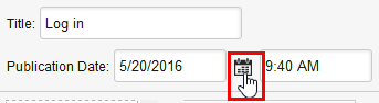
- Click the date picker icon next to the "Publication Date" field:
- Select the day and month when the form/form section will be published.
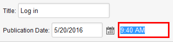
- Highlight the time of day in the "Time" field and enter a new time. For example:
- Click [Apply].
Assign an Expiration Date
By default, a form/form section has no expiration date. To assign an expiration date for a form/form section, follow these steps:
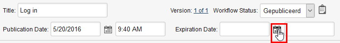
- Click the date picker icon next to the "Expiration Date" field:
- Select the day and month when the form/form section will expire.
- Enter the time of day that the form/form section will expire.
- Click [Apply].
Interactive Forms Workflow
Interactive forms have a defined workflow that determines which actions a user may perform with regard to forms in the Interactive Forms component. The activities that a user may perform are based on their assigned role. By default, users who are assigned the role Application Manager and Main Editor can add and delete the roles that are allowed to perform the specific activities.
In addition to assigning the activities that each role may perform globally for a specific workflow model, you can also assign the roles that are allowed to perform specific activities at the category level. For example, you can specify that all users may create a new form in the category "E-mail" while for the category "Financial" only Application Managers and Main Editors may create a new form.
Selecting the Default Workflow for all Interactive Forms
The Interactive Forms component must have a workflow assigned to it. The default workflow that is assigned to the Interactive Forms component is used for all forms and form sections that do not use a custom workflow that is assigned to a category.
Changing the default workflow model for the Interactive Forms component when it already contains forms and/or form sections could have an adverse affect on those forms/form sections. GX recommends against changing the default workflow model once any forms/form sections have been created.
To assign the default workflow model to the Interactive Forms component, follow these steps:
- In the Interactive Forms module, navigate to Maintain > Workflow.
- In the "Select Workflow Repository Model" section, select the default workflow model for interactive forms/form sections.
- Click [Apply].
Adding Roles to Activities
Each activity that a user can perform in the Interactive Forms component has one or more default roles assigned to it. You can add a role to an activity in order to expand the class of users that may perform a specific task. The following are the three activities to which you can assign roles:
| Activity | Description |
|---|---|
| Create new form | The ability to create a new form or form section using the Forms > New menu option. |
| Maintain planned form | The ability to make modifications to a form or form section that is in the planned state. |
| Maintain published form | The ability to make modifications to a form or form section that is in the published state. |
To add a role to an activity, follow these steps:
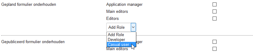
- In the middle column of an activity section, expand the drop-down list and select the role you want to add to the activity. For example:
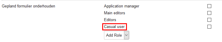
- Click [Apply]. The role is assigned to the activity. For example:
Deleting a Role from an Activity
To remove a role from an activity, follow these steps:
- In the "Delete" column of an activity section, select the role that you want to delete. For example:
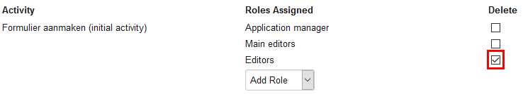
- Click [Apply]. The role is deleted from the activity.
Defining a Custom Workflow for a Category
You can create a customized workflow that is applied to all forms/form sections within a category. This allows you to define permissions for maintaining the forms/form sections within the category that are different from the default workflow used for all interactive forms. To create a custom workflow for a category, follow these steps:
- Navigate to Maintain > Categories.
- In the "Workflow" section, select "Define custom workflow".
- Select the workflow repository model on which to base the custom workflow from the "Based on workflow repository model" drop-down list.
- Follow the steps in the section Adding Roles to Activities for complete information about assigning roles to activities for the customized workflow for the category.
- Click [Apply].
Prefilling a Form Element
Using prefilling, you can fill a form element with input; this will be the default input for the form element for the website visitor. The input you can fill the form element with can be a string that you choose or it can be input from another form element. The latter is accomplished through the use of Interactive Forms internal script in combination with JavaScript.
Prefilling an Element with a String
To prefill a form element with a string, follow these steps:
- Click the form element in the step pane which you want to prefill.
- Expand the properties for the form element by clicking the expand button.
- Under "Prefilling" select "1-Default" from the drop-down list.
- In the text box, enter the string that you want to prefill the form element with.
On the website frontend, the form element will be prefilled with the text you enter. The website visitor can modify the text if they so desire.
Prefilling Using a Free Expression
Using Interactive Forms internal script and/or JavaScript, you can programmatically prefill a form element with input taken from another form element. To prefill a form element using a free expression, follow these steps:
- Click the form element in the step pane which you want to prefill.
- Expand the properties for the form element by clicking the expand button.
- Under "Prefilling" select "2-Free Expression" from the drop-down list.
- Type the free expression in the text box. For complete information on the Interactive Forms internal script and the use of free expressions, see the section Scripting in Forms.
Form Element Validations
Interactive Forms provides a set of validations that can be used to evaluate the information entered in a form element in order to ensure that it complies with the format rules you set forth. If the data entered into the field or fields does not pass the validation, an error message is returned and the visitor does not proceed to the following step. This ensures that the information you receive in a form is always correct. By default, Interactive Forms provides 18 standard validations. It is also possible for a developer to extend the number of validations available. Some form elements have, by default, validations already assigned to them. These are described in the following sections.
To add a validation to a form element, follow these steps:
- Click the form element in the step pane to select it.
- Click the down arrow next to "Validations" in the form element properties section and select the validation from the list.
- Click [Apply]. The validation will appear in the list of validations assigned to the form element.
If a validation appears in italic typeface, that is an indicator that a required field has not been defined. Check the validation's configuration to ensure that it is complete.
The following sections describe each of the standard validations available in Interactive Forms.
Check Bank Account Number
The Check bank account number validation checks to ensure that the account number entered is valid. If the account number does not comply with the required bank account number regulations, an error message appears in the form when the visitor attempts to submit it. The bank account number can contain no letters besides a leading "p", be between seven and nine digits long and cannot begin with zero (0). Other valid input in the bank account number are:
- Period (.)
- Comma (,)
- Spaces
This validation is specific to Dutch bank account numbers.
| Valid | Invalid |
|---|---|
| 57 84 34 009 | 62 09 88 3323 |
| 13 23 586 | 78 44 12 |
| p5365918 | r5365918 |
Check BSN
The Check BSN (Burger Service Number) validation checks to ensure that the BSN entered by the website visitor is valid. The BSN can contain only digits and must be nine digits long. Spaces and commas are also valid. If the BSN number does not comply with the required BSN number regulations, an error message appears in the form when the visitor attempts to submit it. Note: The BSN number is specific to The Netherlands.
| Valid | Invalid |
|---|---|
| 247679472 | 47815978 |
| 541 687 222 | 879.472.557 |
Check Date
The Check Date validation checks to ensure that the date entered by the website visitor is valid. If the date entered by the website visitor us not valid, an error message appears in the form when the visitor attempts to submit it. A valid date is of the form "dd/mm/YYYY". The Check Date validation is assigned to the Date form element by default.
Check Date Day Range
The Check Date Day Range validation checks whether the entered date by the website visitor is not older than X days (compared to the current date). The value of X can be entered at the validation. After adding the Check Date Day Range validation, a text box entitled "Nr of days" appears. Enter the number of days in the date range in this box and click [Apply].
Check Date Range
The Check Date Range validation allows you to specify a range of dates between which the date entered by the website visitor must fall. After adding the Check Date Range validation, two text boxes entitled "From date" and "To date" appear. Enter the begin and end date of the range within which the date entered by the website visitor must fall in the format "dd-MM-yyyy" and click [Apply].
Check File Extension
The Check File Extension validation allows you to ensure that the extension of the file specified by the website visitor has an extension that you expect. You can specify more than one file extension. After adding the Check File Extension validation, a required text box entitled "Valid Extensions" appears. Enter the valid file extension(s). If you enter multiple file extensions, separate them with commas.
Check File Size
The Check File Size validation checks to see if the size of the file specified by the website visitor falls within a specific range. After adding the Check File Size validation, two input boxes appear entitled "Minimum size" and "Maximum size". Enter the range, in bytes, kilobytes, or megabytes. For example, the following values are accepted:
- 1000000
- 1000 KB
- 1 MB
Check File Type
The Check File Type validation analyzes the file being handled by the form element to verify whether its content matches the expected content given the MIME type that is declared in the validation. This is a security feature which ensures that a file containing malicious code cannot be masked and, for example, uploaded to the web server. This validation is assigned by default to the Upload Form Element.
Check ID Cardnumber
The Check ID Cardnumber validation checks whether the identification number entered by the website visitor is valid. A valid ID number begins with the letter "i" followed by a letter between "a" and "z" followed by 7 integers between zero and nine. This validation is specific to the Dutch national identification card.
| Valid | Invalid |
|---|---|
| ix7894532 | gb4781597 |
| ix 7894532 | iv99096123 |
Check KvK Number
The KvK (Kamer van Koophandel) validation checks whether the KvK number entered by the website visitor is valid. A valid KvK number consists of 8 integers. KvK numbers are specific to incorporated Dutch entities.
| Valid | Invalid |
|---|---|
| 12786543 | 9802876 |
Check Number
The Check Number validation checks whether the number entered by the website visitor is a valid integer containing no letters or other illegal characters. Decimal points are accepted and commas are not. The number can be positive or negative.
| Valid | Invalid |
|---|---|
| 12786543 | 9,802876 |
| 9.7 | 54D |
| -1000 | -1,000 |
Check Number Range
The Check Number Range validation checks wither the number entered by the website visitor falls within the specified range. After adding the Check Number Range validation, two required fields appear entitled "minimumValue" and "maximumValue" appear. Enter the minimum and maximum values expected for the number the website visitor should enter and then click [Apply]. Integers are accepted as well as a decimal point. The range can also contain both positive and negative number.
| Valid | Invalid |
|---|---|
| 12786543 | 9,802876 |
| 9.7 | 54D |
| -1000 | -1,000 |
Check Passport Number
The Check Passport Number validation checks whether the passport number entered by the website user is valid. A valid passport number must begin with two letters, the middle six characters letters or numbers, and the last character a number. This validation is specific to Dutch passport numbers.
| Valid | Invalid |
|---|---|
| NLD943249 | N907GR6H |
Check Phone Number
The Check Phone Number validation checks whether the telephone number entered by the website visitor is valid. A valid telephone number begins with a "+" and country code or "00" and the country code followed by nine numbers. This validation is valid for Dutch landline and mobile telephone numbers only.
| Valid | Invalid |
|---|---|
| +31649922009 | 642277509 |
| 0031 30 233 4510 | +31 9098543192 |
Check Postal Code
The Check Postal Code validation checks whether the postal code entered by the website visitor is valid. A valid postal code consists of six characters: four numbers followed by two letters. This validation is valid for Dutch postal codes only.
| Valid | Invalid |
|---|---|
| 3511NK | 567RD9 |
| 3512 PH | D622 09 |
Check Regular Expression
The Check Regular Expression validation parses a regular expression entered by a website visitor in order to check whether it is a valid regular expression. For complete information on regular expressions see http://en.wikipedia.org/wiki/Regular_expression.
For example:
Verify an e-mail address
\b[A-Z0-9._%+-]+@[A-Z0-9.-]+\.[A-Z]{2,4}\b
Verify a date between now and 01-01-1901
(19|20)\d\d[- /.](0[1-9]|1[012])[- /.](0[1-9]|[12][0-9]|3[01])
Verify that a number is between 0 and 255
^([01][0-9][0-9]|2[0-4][0-9]|25[0-5])$
Compare with other Field
The Compare with other Field validation allows you to check whether the input in the current field is identical to that entered in another specific field. After adding the Compare with other Field validation, a required drop-down box entitled "Compare with" appears. Select the field whose input you want to compare to the current field from the drop-down list.
E-mail Format
The E-mail Format validation checks whether the email address entered by the website visitor is valid. The E-mail Format validation is assigned to the E-mail form element by default.
Required
The Required validation checks whether the website visitor has entered data into a field that is required. Note: Assigning this validation to a form element has the same effect as checking the option "Required field" of the form element.
Form Sections
A form section is a sub-form that you can reuse in two or more forms. This is especially useful when you have two or more forms that share identical sets of form elements (sections) — You only have to create the section once and then you can reuse it in multiple forms.
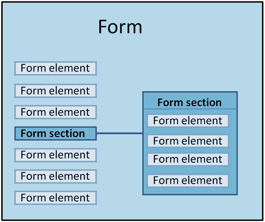
Form sections contain only one step. Just like forms, form sections can have validations, handlers, routers, conditions, and so forth.
Form sections are created and managed in the "Form Sections" tab, located below the "Forms" tab. To open the "Form Sections" tab, click "Form Sections" in the lower left part of the Interactive Forms dialog box. When the "Form Sections" tab opens, you will see the same category tree structure that appears in the "Forms" tab. The number of form sections that belong to each category appears between parentheses. Managing form sections is identical to managing forms (besides having multiple steps).
A form section can only be modified by one user at a time. For avoid conflicts, XperienCentral locks a form section when it is being edited, which means that other users cannot open it and modify it. See Opening a Form for complete information.